


Finding the right balance between fresh and formal designs on corporate websites
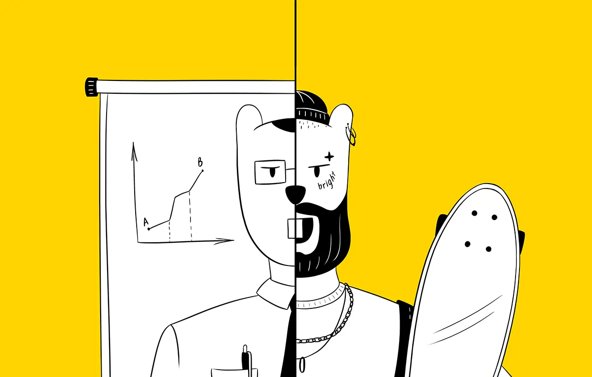
When designing a website for a major corporation, there is a risk of veering towards an excessively reserved design or, on the contrary, of distorting the brand’s image by creating a catchy, but too informal, or playful style. We have seen both extremes. In the first case, websites function as designed but fail to fully empower the brand as they look more like corporate financial reports. In the second case, the website may be easy on the eye but difficult to use and will eventually have to be simplified or even completely redone.
We want to show you how to find balance between formality and freshness in your corporate website design.
Let’s start by grading companies by scale, which will help us understand the various issues that we’ll have to come up against:
1. a monopoly, to which there is no alternative
2. a large B2B company
3. a medium-sized B2B company
4. a B2C company
The first group includes, for example, Google, Apple, Tesla. Interestingly, all these global corporations understand the importance of creating a modern image. They are the subjects of close scrutiny from both the state and the public and must look friendly. They understand that even there are substitutes for their services (one can travel by air instead of by train; one can buy an Android in place of an iPhone).
The third group is racing after large companies while looking up to the first group. They want to be in the first group, but they are not as well known, and still need to invest in developing their image.
The fourth group exists in a challenging competitive environment fighting for customers’ attention. They have long realized that it is image that sells.
The second group often believe they are important and powerful enough to spend money on strengthening their image with a jazzy and modern visual style. Sometimes they go for excessive restraint believing that this style choice is what sets apart large corporations from the rest. As a result, they may lose a major part of their visual identity.
When we were designing a website for AFK Sistema, our goal was to create a modern look, while respecting certain restrictions.
First Group of Restrictions
On the one hand, AFK Sistema is a large corporation with assets, investors and boards. Therefore, some approaches were off limits such as poster style, huge fonts, or other features of presentation design.
On the other hand, our client understands that the company’s brand relies on visual images, so it was important to our client that the company have a solid up-to-date website with a rich, visually intensive and recognizable style. AFK Sistema is a diverse investment company. It does not have a single material product that could serve as its visual focus.
Second Group of Restrictions
We are creating a style for a website interface. Not a promo video, or a stand, or even merchandise.
People come to the website with different goals in mind, from finding information or applying for a job, to checking the news, press releases, etc.
Consequently, a visual image takes form in two stages:
1. First impression: forming one’s opinion unconsciously during the first five seconds.
2. Communication: when a visitor browses the website and finds the information they need. This scenario creates a more conscious impression.
Components to work with during these two stages of communication:
1. Key visuals: web page headers
2. Data display through text, graphics, charts and tables
3. Infographics and interface features, such as maps, timelines etc.
4. Photographs
First Impression
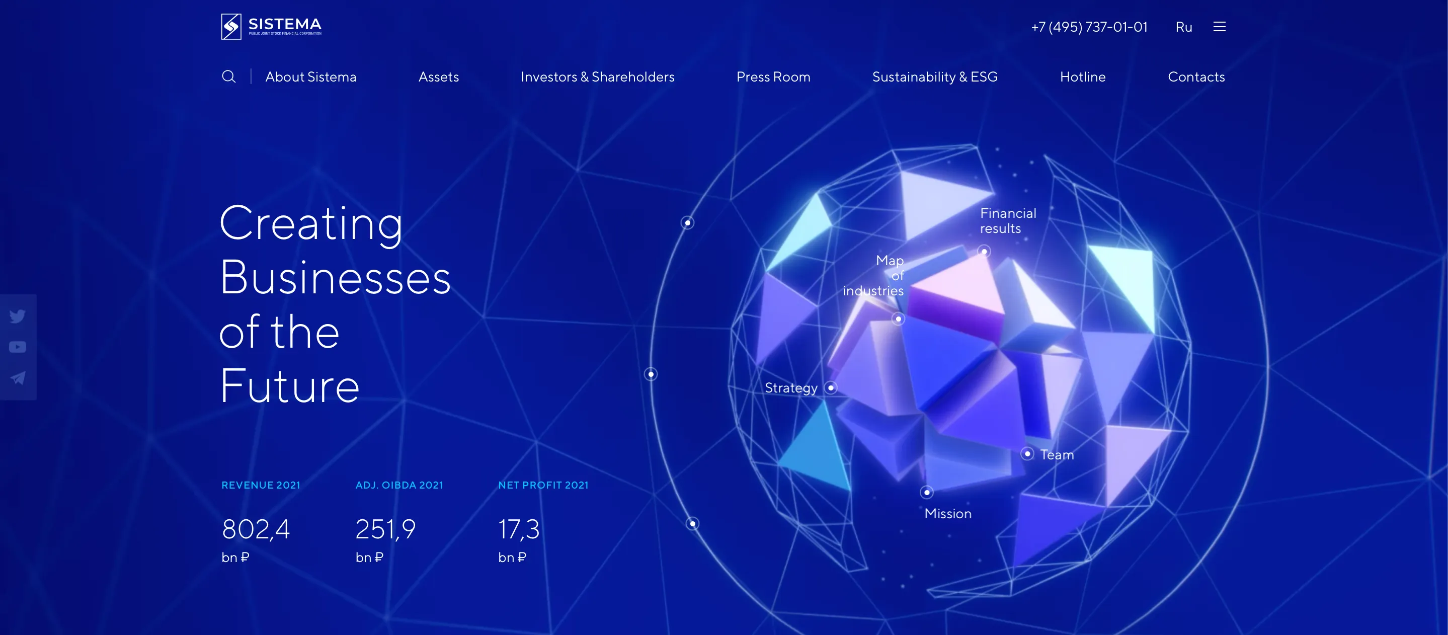
Creating visual contrast is important to make a strong first impression. We managed to do this by combining austere colors, using a strict grid and fonts, while opting for a non-standard presentation of visuals in the header.
On the home page, we focus on primary graphics, which serve both as a video illustration and interactive navigation at the same time. Modern web design creates opportunities for creative features that integrate video and development.
In addition to several primary pages, we also added video to the header to maintain a consistent image on the home page. Video illustrations on the website create a visual narrative, while at the same time conveying the meaning and message of each specific page.
With this approach, users will get a sense of our general visual concept upon their first visit, even during superficial browsing. They will see the right images and get the correct first impression.
Our video production team takes a full-cycle approach to each project, from inception, script writing, directing animation all the way to quality motion design. It is important to find a good mixture of in-video animation and interface animation (menu, titles and cards).
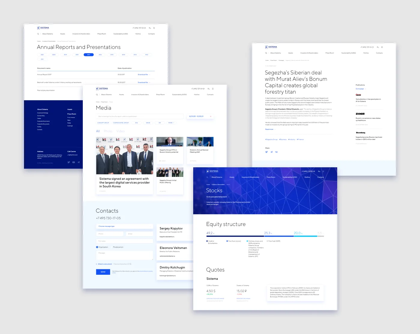
Communications
When browsing, website visitors interact with interface and content.
Creating an effective interface and content style is a more complicated task. Style-wise, design is often limited to the header. But for us, the style element is just as important as other key images.
We use various interface and content design features to create the necessary impression:
· Timelines include infographics, text and photography;
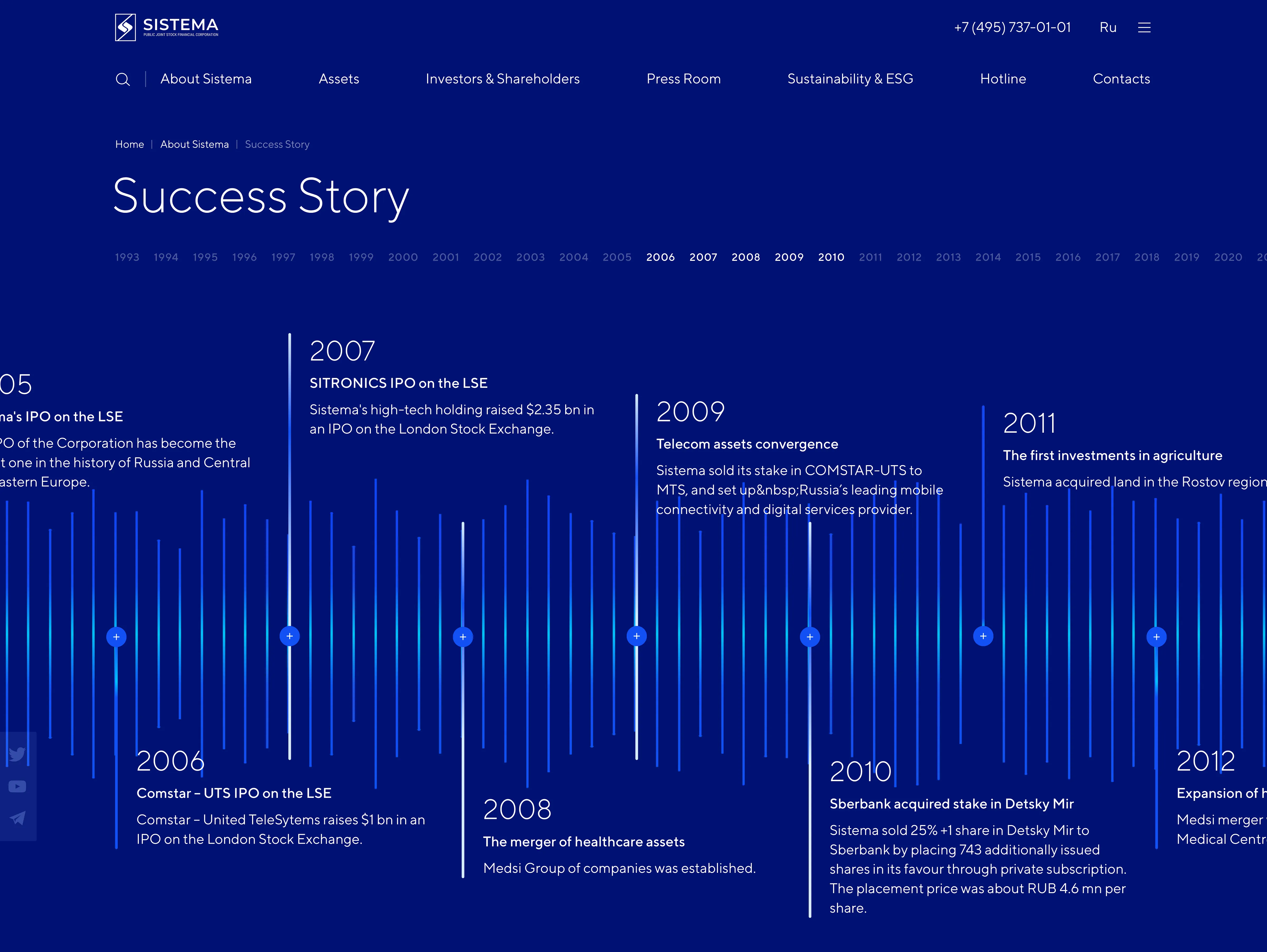
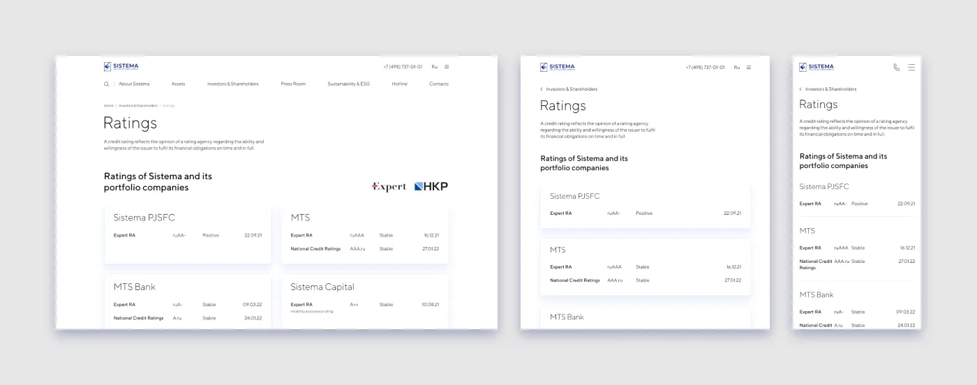
· Infographics are both informative and instrumental in conveying the visual style;
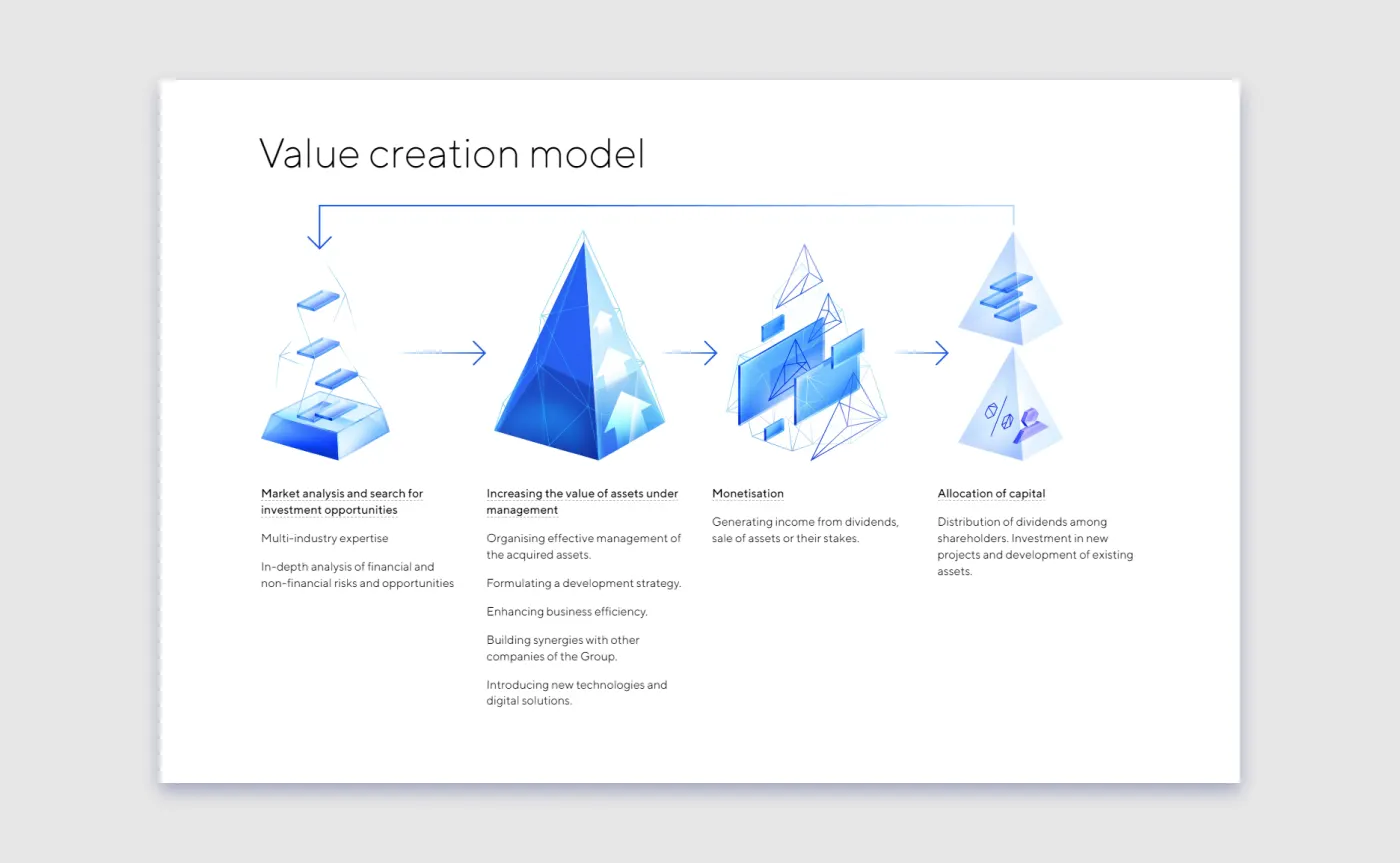
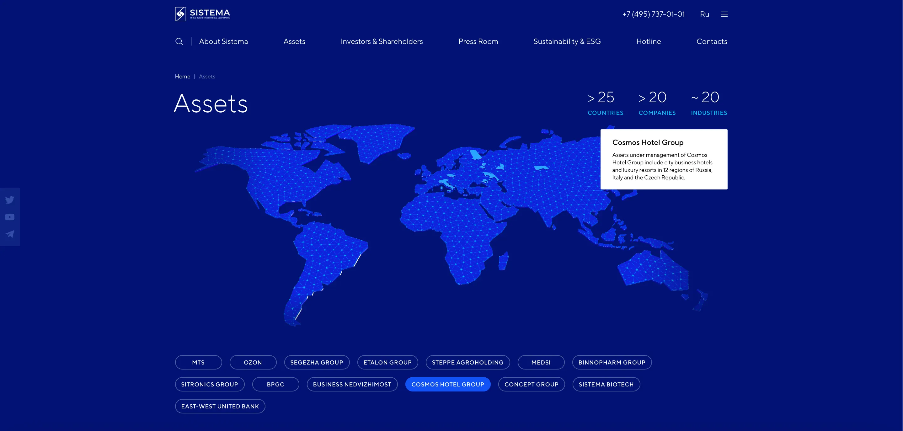
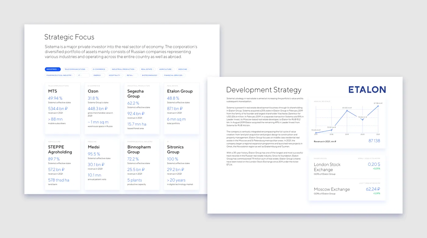
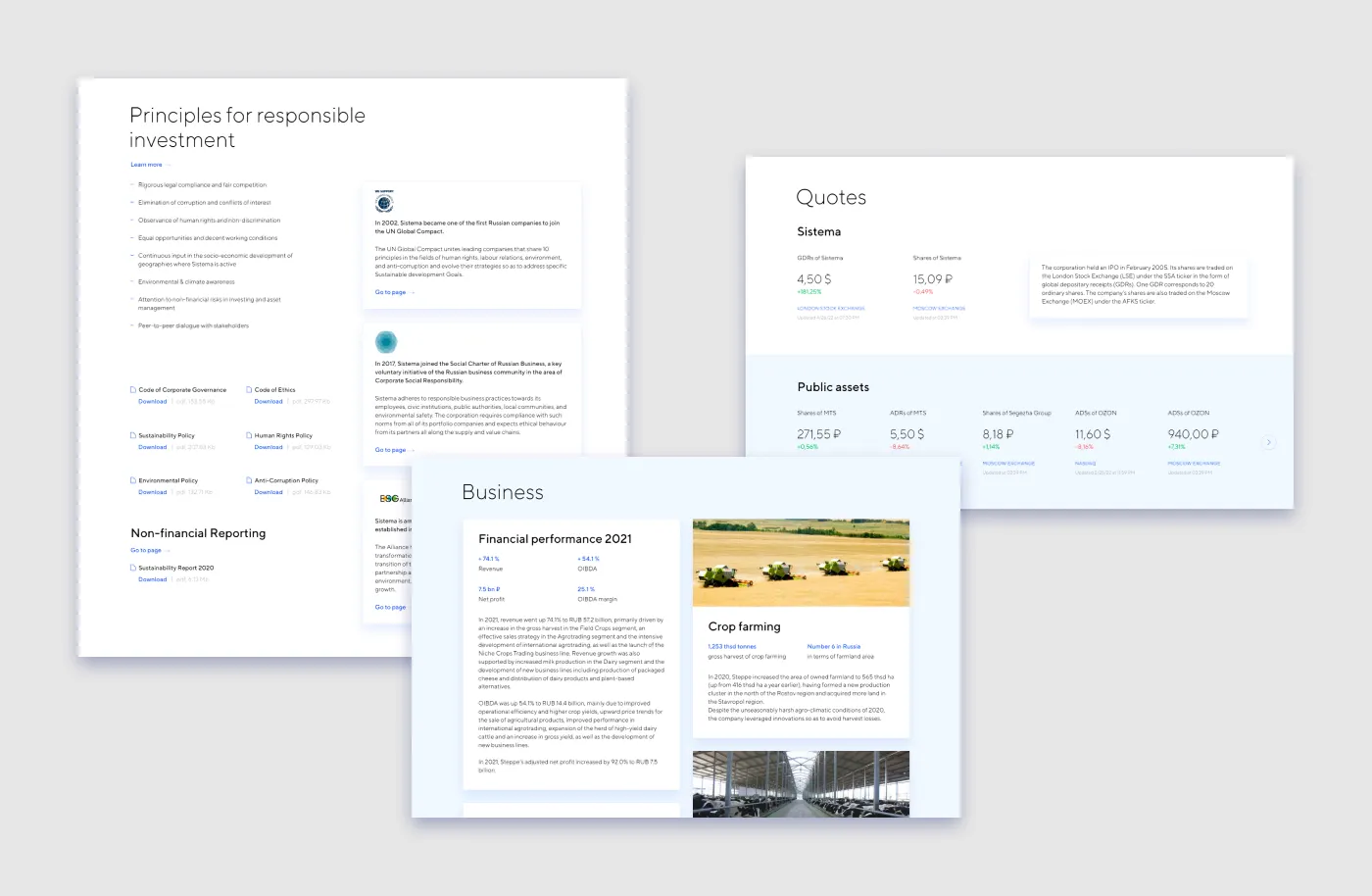
· Data display, including icons, cards, groups of cards, fonts, charts and AFK Sistema’s asset geography map.

To create our overall style, we put to use all the components that design consists of. The challenge was to invent solutions that will live on as the website changes and more content is published.
To achieve this, we test run design features on various content sources. We try different character limits for figures and text, different lengths for titles and links, place photos both on light and dark backgrounds, and use varying formats for content in tables, etc.
We make sure that the interface layout works equally well regardless of resolution and types of content.
This work at first glance is less noticeable, but it is exactly what makes our visual style consistent and rich across all pages.
Take-aways
AFK Sistema now has an appealing website which has won several international awards. The company is happy with the result. Based on visitors’ targeted activity, it is clear that the interface is convenient and easy to interact with. The rejection metric for the most-visited pages is within a very small range, meaning that the website is thoroughly built and users find what they expect. The exit rate for navigation pages is low.
If we look at how the Entry Page — Second Page script works for a specific section, the exit rate is within a very small range while the rejection rate is zero.
The rejection rate is also low for the mobile version. while the browsing time on it is approximately the same as on the desktop version, which indicates that the mobile version does its job for users.
When you begin working on a visual image for a large company, remember that you have tricks-of-the-trade to help you avoid designing either an excessively static or an excessively informal image. Both of these extremes should be ruled out when contemplating style design for a modern large business.
Balance of Formality and Vivid Impression
Therefore, embrace contrast. Use rich interactive images to create a dynamic modern impression, but don’t shy away from using austere layouts, grids and fonts to build a core that portrays a confident and reputable company. Meticulously tweak content pages, add infographics and invest time in properly-styled photo content. All these tactics will help you achieve a consistent, modern and fresh image for a corporation’s online presence.