


Founder to Founders: How to Build A Website That Brings Leads
A guide for founders on what to consider when building a website
Do you need a website if everyone’s on Telegram and Instagram?
Short answer, yes. Long answer? Let’s break it down.
Overview
In this guide, our founder, Alexander Ustinov, answers the following questions:
- Why do founders need websites?
- What mistakes do founders make when building a website?
- How to avoid them?
He then gives references to galleries where founders can find examples of great websites. He also showed the example of a great website from one of our projects.
Why Founders Still Need Websites
Even if you’re focusing on direct channels like Telegram or Instagram, you still need a place where your idea lives, clearly and independently. Your site:
- Establishes legitimacy
- Collects leads and validates demand
- Gives you a space to test positioning
- Offers a consistent reference point across platforms
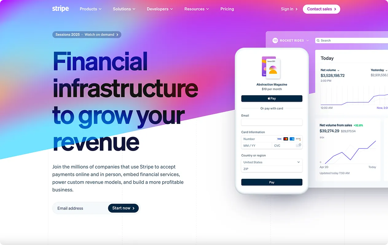
A site works while you sleep. But only if it’s done well. Take a look at the Stripe site, for example:
Most Founders Get This Wrong
The most common mistakes we see:
- No clear value proposition
- Focusing on features, not outcomes
- Trying to design before answering key business questions
- Lack of emotional clarity
- The founder is not involved in the brief
Designers can’t save a weak concept with visuals alone. Structure comes first.
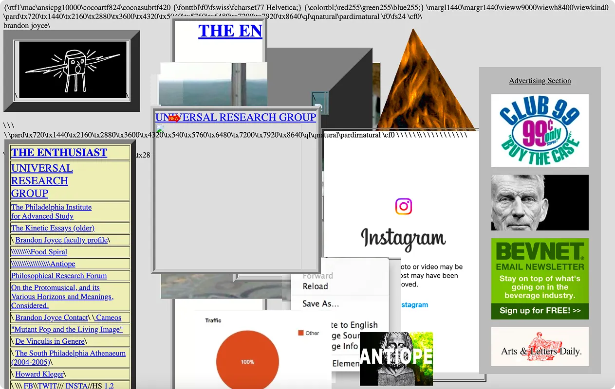
Otherwise, you’re risking having a site where nothing works like this :)
What to do
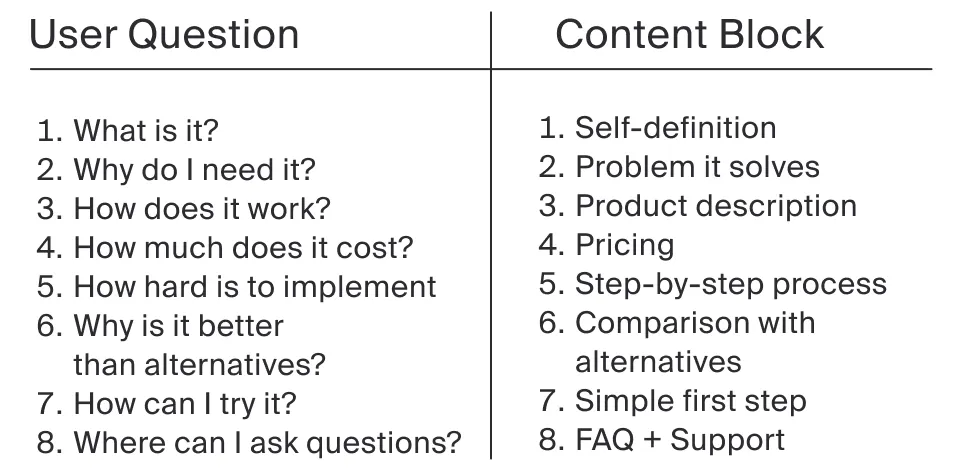
Ask These 4 Questions Before You Brief a Designer:
- What problem are you solving?
- Who are you solving it for?
- What do you want people to do on the page?
- Where will people come from (traffic source)?
These answers shape copy, layout, CTA placement, and tone. Every answer to the question should lead to its content block.
Note: Some of the blocks can be combined, and the sequence may vary.
How to Build a Strong Brief
A good brief includes:
- Clear goal (collect emails, signups, downloads?)
- Customer persona(s)
- Brand tone and references
- Functional requirements (form, payment, etc.)
- Visual references (what to avoid, what to lean into)
Here are some resources where you can choose references:
You can find real site examples there, with filters by project type and page category.
At last, let’s take a look at the design that makes your site more powerful.
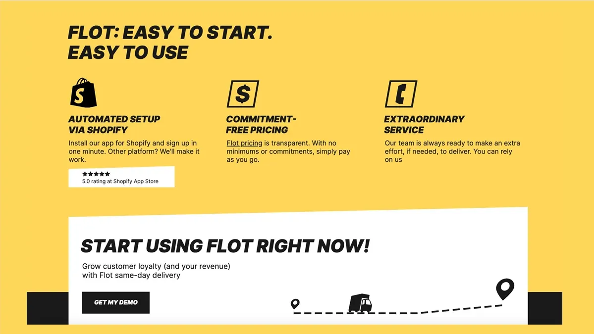
Design Tips That Work in 2025
- Clarity beats cleverness. Make your message instantly clear.
- Use structure: headline → subheadline → visual → CTA.
- Keep forms short. Every extra field drops conversion.
- Typography matters. Choose readable, modern fonts.
- Be mobile-first. Half your audience will see the site on their phone.
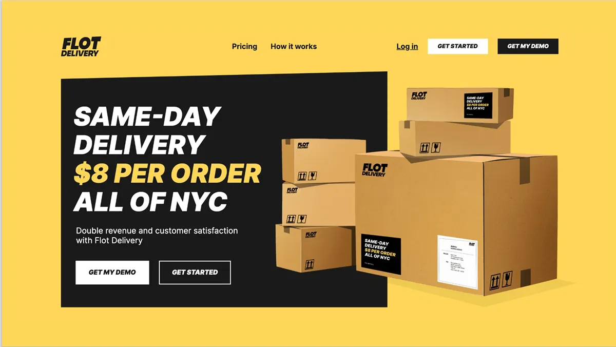
Example of a good website from one of our projects
Main page
Having seen the main page, the users see
- Company’s name: Flot Delivery
- Product offer: Same-day delivery $8 per order all of NYC
- Benefit: Double revenue and customer satisfaction
- CTA: Get my demo/get started
- Visuals support the message: Boxes of different sizes
That is the main page that answers the questions:
- What is it?
- Why do I need it?
- How much does it cost?
Features

Next, the user sees why he needs it in more detail. Since Flot Delivery works with shop owners in NYC, they demonstrate the benefits that shop owners can expect to receive by working with Flot Delivery.
- Boost checkout rate by 20–30%
- Enjoy 50–70% more repeat purchases
- Pay less for same-day delivery
Social Proof Block
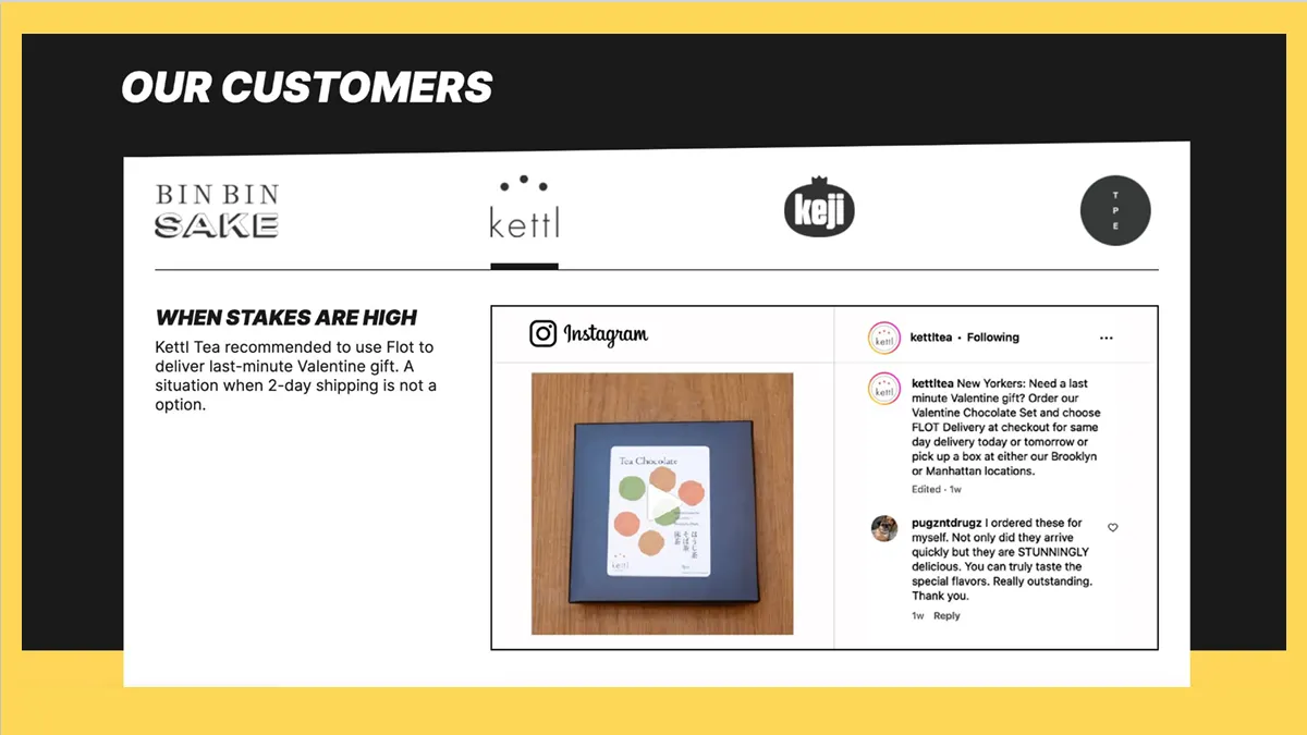
Before leading the user to the CTA section, we also added a social proof block. Since the service was new to NYC, people needed to see that it could be trusted.
CTA block
This block answers the questions:
- How can I try it?
- Where can I ask questions?
It gives a clear message on the first step to get started.
Step-by-step process block
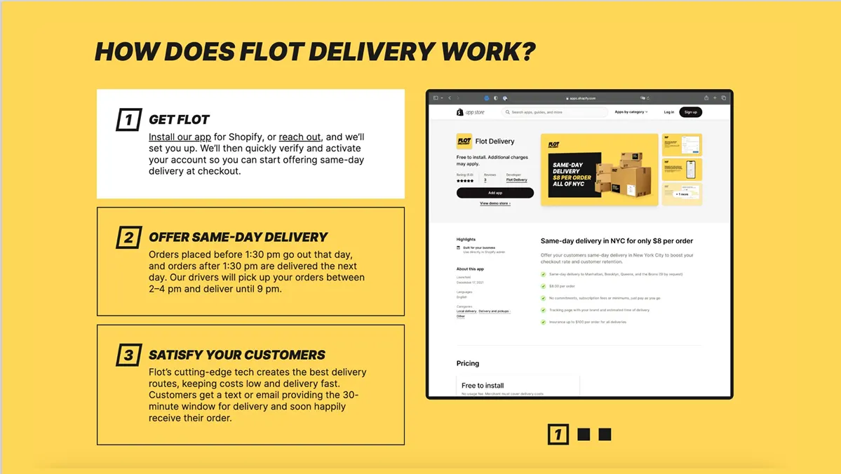
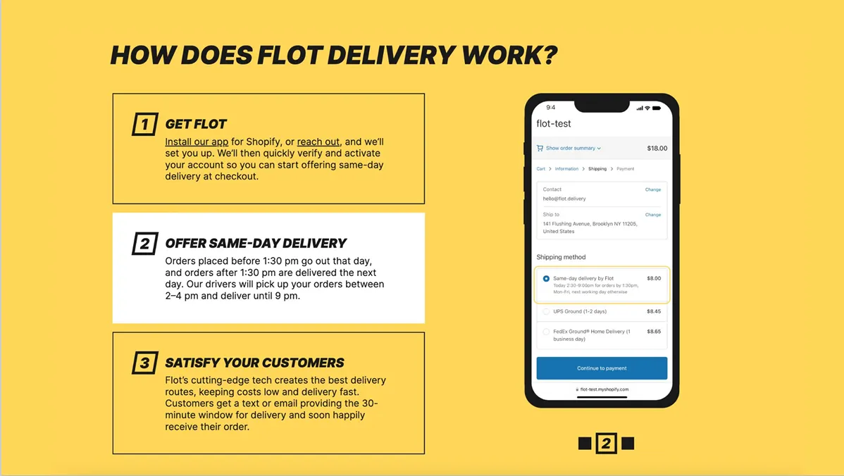
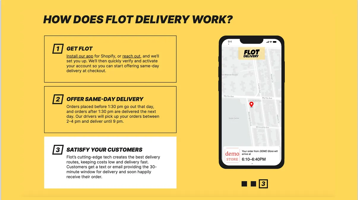
The block shows the user how hard this product is to implement:
- Where to get it
- How to place the delivery
- What to expect
Pricing block
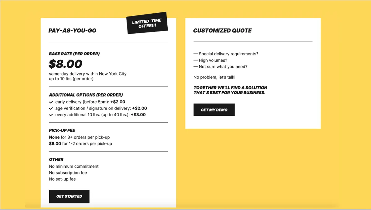
We showed the price in several places. The first is on the main page, and the second is on a separate page.
On the pricing page, the user sees what the cost is and what can be added.
Final Thought
A site isn’t about beautiful design. It’s about showing you know what you’re doing and who you’re doing it for.
Build it with clarity. Write it like a conversation. Design it like an entry point, not a poster.
Want feedback on your site? Talk to Alex, he gives his honest opinion and valuable tips on how to make your website better.