


How the design of Plata Bank is created
.png)
We explore the idea and cultural context behind Plata Bank's brand, and the qualities designers need to build the company's design.
DOBAR DABAR! — a podcast about designers living in different countries, from the Philippines to Argentina. In the new episode, I spoke with Alexander Nikolaev, a brand designer at Plata who has been responsible for the bank's brand, visual identity, and meaning since its foundation — for almost four years now. He joined us from Mexico City. We talked about how to build a bank from scratch, why Mexicans don't like minimalism, and where the limits of AI lie in this work.
What is Plata
Plata is a Mexican digital bank with no branches, operating entirely through a mobile app. It was founded in 2023 by former top executives at Tinkoff — Neri Tollardo, Alexander Bro, and Danil Anisimov. Starting out with credit cards, Plata went on to obtain a full banking license from Mexico’s financial regulator, CNBV, completing a three-year process. By early 2026, the company had grown to around 3 million active users and was issuing roughly 10% of all new credit cards in the country. Its valuation reached $3.1 billion in its latest funding round, while the bank now claims a $5 billion valuation on its website.

How it all started: a small team, and the bank's brand as the Rebel and Explorer archetypes
I asked Alexander to tell me how it all began. It turned out everything started quite literally with an idea on a napkin.
When I joined, there were four designers. There was a blank sheet of paper and just one idea — we wanted a bank to be called this, to have sort of orange as its main color. And that's it. That’s how we got started.
The founders set the direction — they had already lived in Mexico and studied the market, so they “threw the dart roughly in the right direction”: a bold, innovative, digital bank.

Alexander then started breaking this idea down into its components. He studied local brands — their values, audiences, and messages — and organized them into matrices. It turned out that the niche was open!
There was no bold, sort of rock'n'roll bank with an orange color on the Mexican market. All that remained was to develop this positioning. The tool we used was psychogeometry, where visual anchors — what attracts different types of people — were combined with Jungian archetypes and consumer types.

They chose two archetypes. The first was the Rebel — bright and disruptive, challenging conventional ideas about banking. The second was the Explorer, chosen with the future in mind.
The biggest bank in Mexico City also had the Explorer archetype. So those are the people we're going to win over.
The values were then embedded into the tone of voice, literally word by word: independence for the Explorer, and “everything is different now” plus honesty for the Rebel. The key honest message was Real Money, Real Cashback.
There was nothing like this here before. So this honest phrase really worked well.
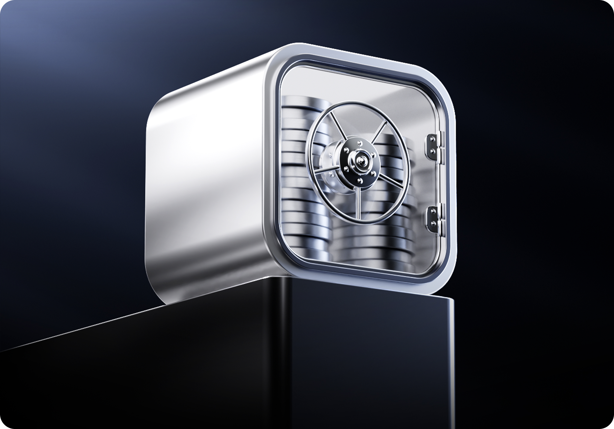
Essentially, the brand helped the bank get off to a fast start and immediately stand out. And the ultimate dream for any designer is recognizability without a logo.
I really envy Adidas. There was a phase when they could just show their brand through three stripes — nothing else, no identifying marks. I'd love to work on something like that, where you could simply remove the logo. But we've still got a long way to go.
Today, the bank's identifying elements are its orange color, which the team is gradually moving away from so as not to blend in with DiDi's orange taxis, and its signature use of metal and light.
My favorite thought. A good artist paints the shadow, while a great one also paints the light. And not just any light, but light with a story, so that there is something in the reflection that affects you.
We're waiting for lightmorphism to come after glassmorphism.


How the product was built by four people
For the first year and a half, the team built the product themselves in Cyprus, four people working side by side. Design system, app, branding, visual identity — everything at once and all at the same time.
Just imagine — there is literally nothing, and you need to create an app with a design system, develop the marketing, come up with the branding.


An interesting detail from Alexander's background: he applied to study design, didn't get a state-funded place, and eventually studied civil engineering instead. He doesn't regret it now.
My engineering education actually helped me a lot when working with complex systems and meanings. It is a science, after all, and you have to understand it. With an art education, I would probably just be talking beautifully about the difference between Monet and Manet by now.
Alexander also said that he had been developing his design fundamentals in parallel since childhood.
He also deliberately refuses to divide designers into “interface” and “graphic” designers — in a project where everything needs to be done at once, this versatility becomes a superpower.
How the team works: the “don't make bad things” standard
Plata grew out of a team of former T-Bank employees, and they brought that approach with them. Only, as Alexander puts it, they “turned it up several notches”: very direct feedback, extremely high quality standards, and a huge number of iterations.
A vivid example is the “Plus” subscription icon, which he spent five months designing.
Plus in a square, plus in a diamond, an upside-down plus — there were all kinds of pluses. And when we finally found the perfect one, we started looking for its color. That was another whole bunch of rounds.

At first, the perfectionism was annoying: “I'm rebuilding these pixels by hand so many times — seriously, why?” Later, it became his own principle. And, fortunately, something the market started to notice.
More and more often, I feel like someone is looking over our shoulder. Someone has made a card exactly the same way — with the same color, the same light. Well, that means they're looking at us.

Mexico: minimalism is perceived as poverty
What interested me most was the cultural aspect, and Sasha revealed the key insight — Mexico's visual language is completely different from Russia's.

If everything for us is about minimalism, Bauhaus, and strict typefaces, that simply doesn't work here. Here, everything is handcrafted, contrasting, and mixed. Terracotta, fuchsia, blue and yellow shades — warm, soulful combinations.
Minimalism, which the team associated with “premium and expensive,” was perceived by Mexicans in exactly the opposite way.
This person didn't even make an effort to add color to it. Why should I be interested in this at all?
Even Apple, after putting black letters on a white background around the city, eventually started adding Mexican emojis to its posters.
And that's where the failures came from. For New Year's, the team created merch with the word Plata in the style of Pokras Lampas — which seemed cool to the team.
We showed it to Mexicans, and they said: “Are you serious? Marginalized people in our favelas wear stuff like this.” The conclusion was simple — test everything with the people who will actually use it.
It's another planet, another way of perceiving things. And now I understand how lucky I am to be in Mexico — there is someone I can ask directly instead of guessing.
That's why the brand is still evolving: the team is moving away from pure bright orange toward darker shades and brown, using the metaphor of “light on a wall,” as if rays of light were falling onto an orange wall in the shadows.
The team spent a long time searching for the balance between “cheap” bright orange and “premium” black through trial and error — and by asking their Mexican colleagues.

AI: there is no “Make It Perfect” button
AI have opened up a lot of possibilities, especially after working with limited stock libraries.
Before: if it wasn't in the stock library, that was it — everything became much harder. You had to organize a photo shoot or spend a long time making a collage in Photoshop. Now you can just write “I want something like this” — and get it.
But the idea of “I'll press a button and get the perfect result” is overrated.
Alexander explains this using a key banner featuring a woman as an example: the background was generated, the card was rendered separately in 3D with the correct lighting — because AI get lines and lettering wrong — and the hand was generated separately because of pixel quality. Then everything was assembled and processed, and “Nikita, of course, got very tired cleaning things up after AI.”
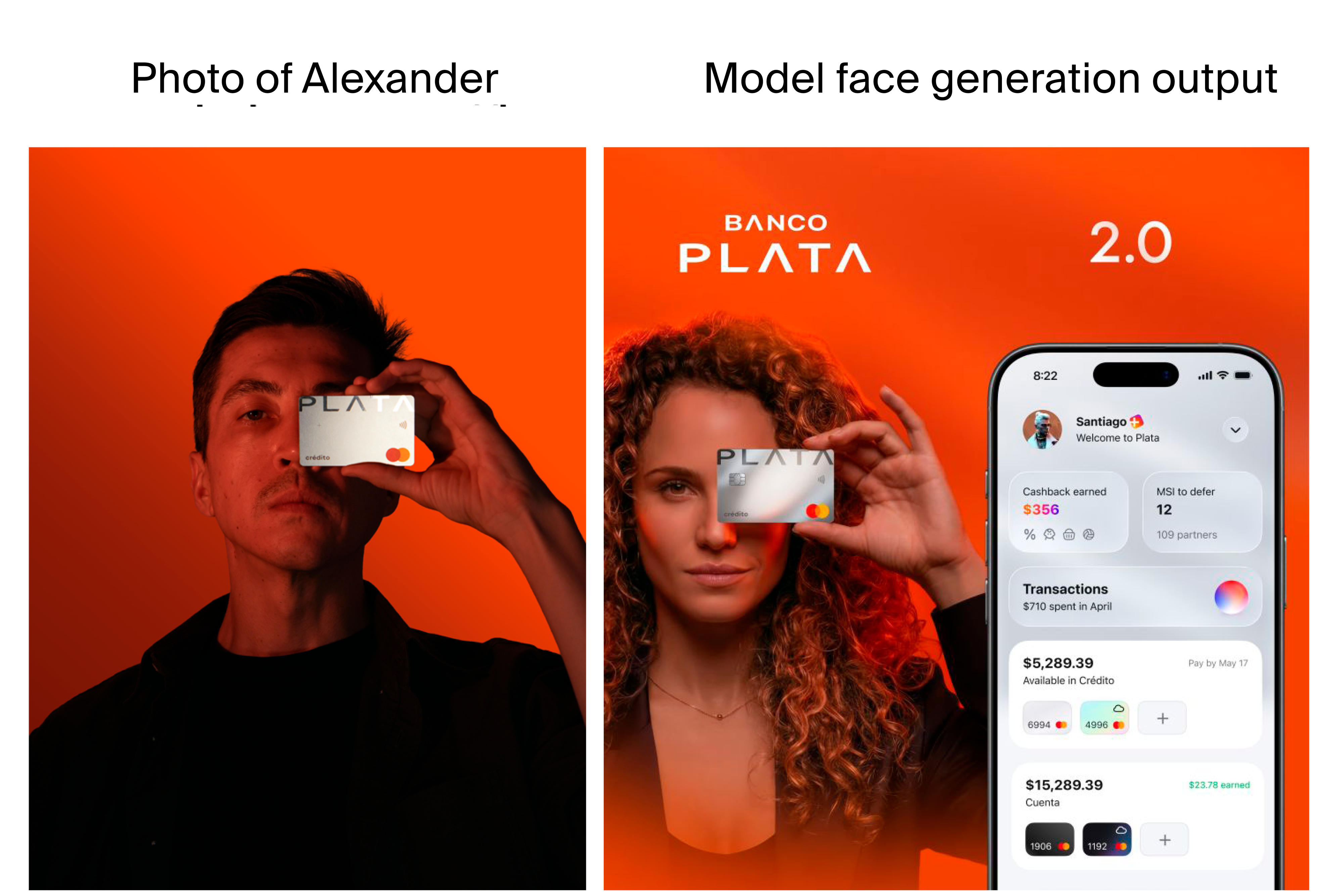
The conclusion is an honest one: if you tend to overlook the minor details and the play of light and shadow doesn't matter to you, then AI is already good to go. But for a commercial product with high quality standards, Photoshop still comes out.
For me, this conversation is about how a strong brand is still crafted by hand: built from core meanings, deep immersion into another culture, and a stubborn attention to detail that no button can replace just yet. That's why I love conversations like these on DOBAR DABAR!
Watch the full version on YouTube:
https://www.youtube.com/watch?v=a5k_iXsb4-Q
P.S. Here are the six key qualities of a designer, according to Alexander Nikolaev, that are worth paying attention to when building a team:
- Versatility — don't separate visual design from logic. I never understood this division between “interface” and “graphic” designers. Do they have no visual skills at all, or do their visuals have no logic?
- Strong fundamentals. What a designer brings to a project and what doesn't need to be taught all over again. The fundamentals are what they are. That's what has kept me going and become my main superpower.
- High standards and a willingness to iterate endlessly. The principle of “don't make bad things”: you simply stop letting things through that aren't as good as you want them to be.
- Immersion in the environment and understanding the user. Don't work from an “ivory tower”; test everything with the people who will actually use it. How lucky I am that there is someone I can ask directly instead of guessing.
- Craftsmanship — the ability to draw light, not just shadow. A good artist paints the shadow, while a great one also paints the light.
- The ability to create an emotional hook. In a world where every interface looks the same, the main task is to trigger an emotion and leave a lasting impression.
If you reduce it to one idea: a strong designer is a versatile professional with solid fundamentals who maintains high standards, immerses themselves deeply in the environment, and masters the craft down to the level of working with light.