


How to Create Presentations That Work

Insights from Alex Ustinov
Imagine this:
You’re a founder pitching in front of investors. Or maybe you’re an employee presenting project results to your boss. Or a freelancer sending a proposal to a client over email. The task seems clear — you need a presentation.
But here’s the question:
Should your slides include everything you want to say — text, visuals, data — just to prove how much effort you’ve put in?Or should you keep it so minimal that no one really understands the idea without you there to explain it?
Most people confuse these two formats, and as a result, their presentations fail to achieve their intended purpose.
So what’s the right way?
Let’s break it down.
Our founder, Alex Ustinov, a branding and digital product design expert, explains what makes a presentation not only beautiful but also practical — one that actually yields results.
Here’s what you’ll read about for the next few minutes:
- Why a live pitch and an email deck are not the same thing
- 3 key principles behind a powerful live presentation
- What really matters when you’re creating an email presentation
- Small design details that make a huge difference
- Best tools to use (and what not to waste time on)
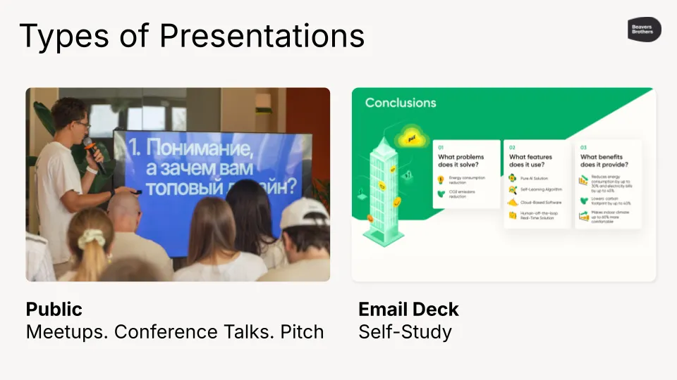
Live Pitch ≠ Presentation Deck for Email

There’s no such thing as a “one-size-fits-all” presentation, because public presentations and email decks serve entirely different purposes.
In a public setting, like a pitch or a talk, your slides are there to support your speech, not repeat it; they should be clean, minimal, and visually engaging, helping your audience stay focused on what you’re saying.
In contrast, an email deck must stand on its own, clearly conveying your message without any additional context or voiceover. Every slide should be self-explanatory, structured, and easy to digest, even on a small phone screen.
Trying to use one format for both situations almost always results in a presentation that fails to meet the needs of either. That’s why you need two separate templates, each optimized for its specific scenario.
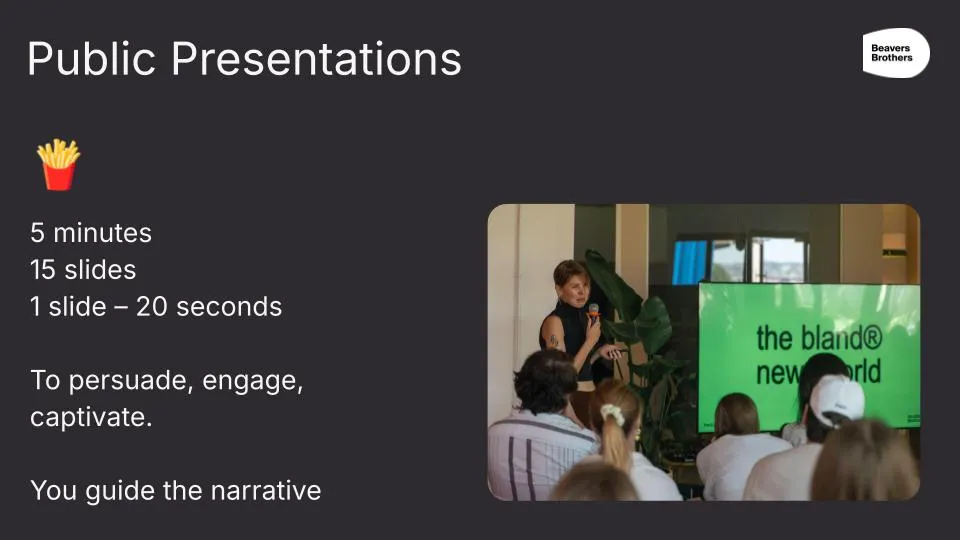
3 Key Principles for Public Presentations
- Less text, more meaning.
Each slide should deliver a single clear thought, ideally in 5–7 words or a short phrase, avoiding dense paragraphs that distract from your speech. - Control attention.
Use visual hierarchy to guide the viewer’s eye, with large, bold headlines and one clear focal point per slide, making it immediately obvious what matters most. - Pace and rhythm.
Keep the audience engaged by varying the structure of your slides, alternating between images, key figures, quotes, or storytelling moments, so the presentation flows like a conversation rather than a static document.
Together, these principles help you maintain clarity, impact, and energy, while letting you, not your slides, be the star of the show.
What Matters in Email Presentations
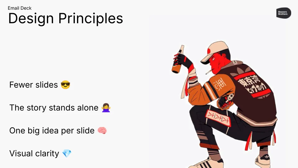
- People read them alone, often on their mobile devices.
Your deck needs to work without any explanation — no voiceover, no presenter, just the slides. Keep in mind that many people will view it on their phones, so clarity and readability are critical. - They need to be 100% self-explanatory.
Each slide should communicate a complete thought. The reader should instantly understand your point without having to guess what you meant. - Keep it short: 10–20 slides max.
Long decks get ignored. The tighter and more focused your presentation, the more likely it will be read. - Every slide should follow a logical structure: one idea, proof, and conclusion.
Stick to a clear structure: make a claim, support it, and conclude with a takeaway. This keeps the message sharp and convincing. - Titles should be descriptive, like article headlines.
Don’t use vague labels like “Market.” Instead, write titles that summarize the insight, like “We’re entering the US B2B SaaS market.”
The Details That Make the Difference
Typography
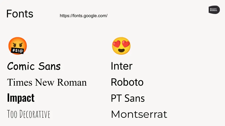
- Use clean, sans-serif fonts like Inter, Roboto, or PT Sans — they’re modern, readable, and widely supported.
- Avoid fonts like Comic Sans, decorative styles, or fonts that are too narrow or overly bold, as they can look unprofessional or be hard to read.
- For legibility during presentations, titles should be at least 36 pt, and body text no smaller than 24 pt.
- To prevent font rendering issues on other devices, always export and send your presentation as a PDF.
Color
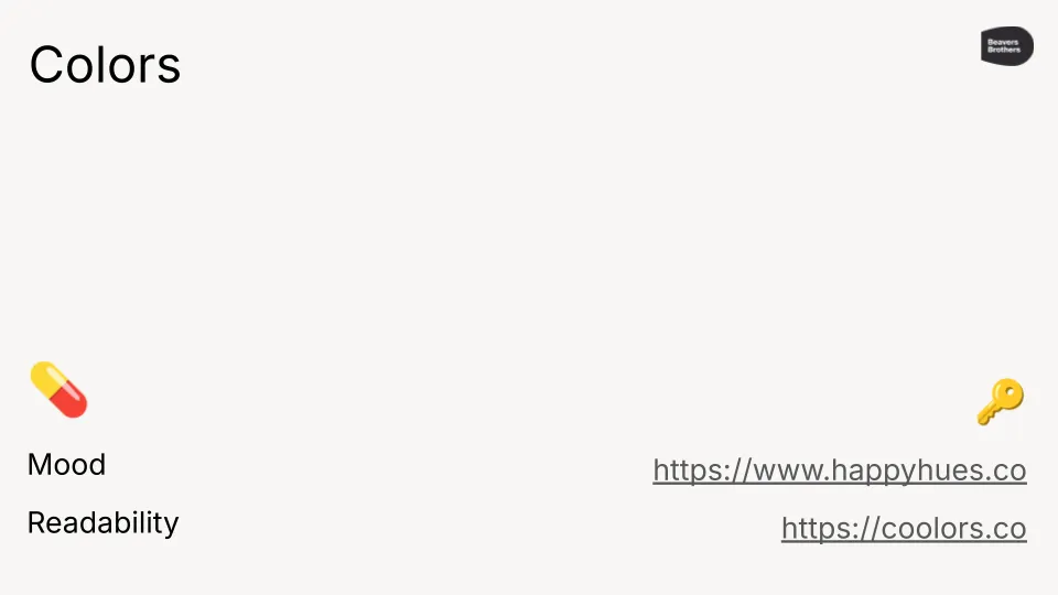
- High contrast between text and background is essential for ensuring readability across all screens and in various lighting conditions.
- The safest option is dark text on a light background — especially when presenting in bright rooms or with projectors.
- Avoid neon, trendy, or overly saturated colors — they tire the eyes and often look unprofessional.
- Stick to a muted palette and use only one accent color per presentation to draw attention where it matters.
Charts and Graphs
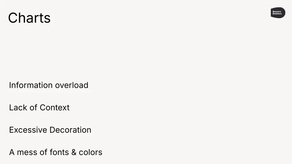
- Limit yourself to one chart or graph per slide to avoid visual overload and help the audience focus.
- Present only the essential data — ideally 5 to 7 data points — so your message stays clear and digestible.
- Use a single highlight color to emphasize key insights, while keeping the rest of the chart in neutral tones.
- Always label your axes and place legends directly on the slide, so viewers immediately understand what they’re looking at.
Photos

- Use high-quality, professional-looking headshots that are well-lit, feature neutral backgrounds, and convey friendly expressions.
- Avoid selfies, low-resolution images, or photos that appear to have been taken for social media or dating apps.
- If a professional photo isn’t available, you can use AI tools to generate clean, business-style portraits quickly and easily.
Tools
You can use any design tool you’re comfortable with — Figma, PowerPoint, Keynote, or Canva all work well for creating presentations.
What matters most is that the tool allows you to export your final version as a PDF, ensuring that your formatting and fonts remain intact across all devices.
Avoid using fancy transitions or animations; they often distract more than they help and tend to break on unfamiliar systems. These effects are only helpful for internal presentations where you control the environment and the playback.
Whether you’re standing in front of investors or sending a deck to a potential client, your presentation has a job to do, and that job is not to impress with visuals alone. It’s to communicate clearly, quickly, and with purpose.
The most effective presentations aren’t the flashiest or the most complex. They’re the ones that respect the viewer’s time, guide their attention, and deliver a message that sticks.
So before you design your next deck, ask yourself:
- Who will read it and how?
- What is the one thing you want them to remember?
Build from there and let clarity drive every design decision.
Because when your presentation does its job, you get the result you came for.
Follow us on Medium, YouTube, Instagram, LinkedIn, and X to explore more insights about design and see the projects we’re working on.