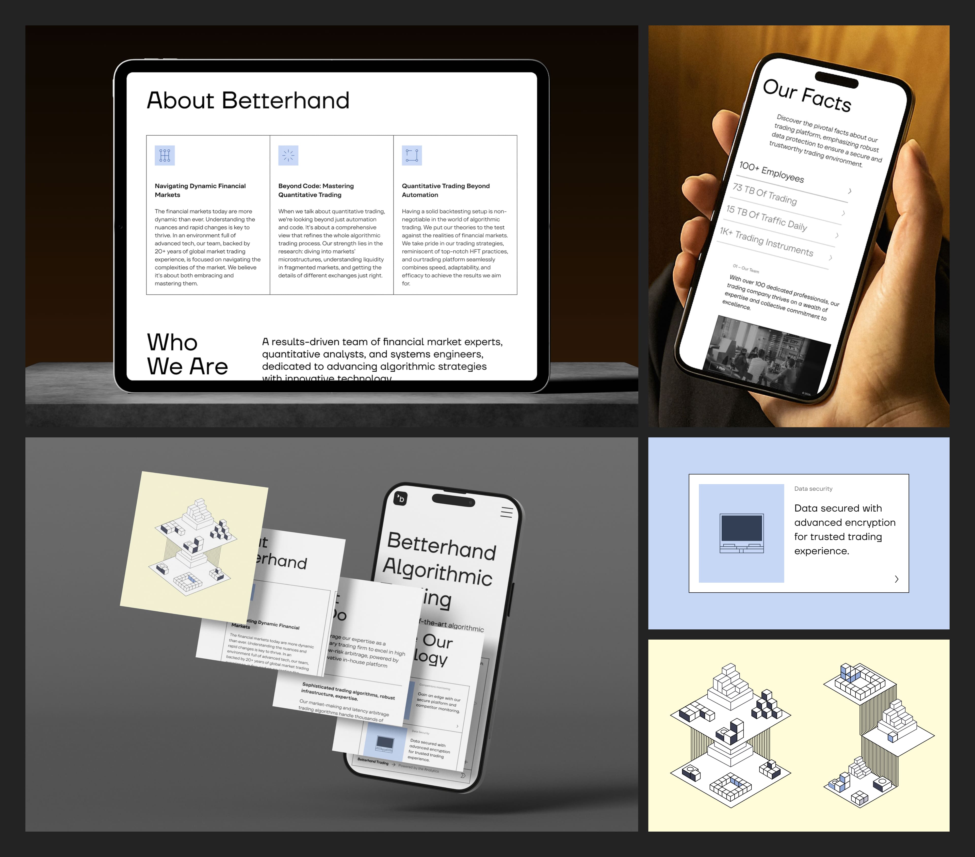
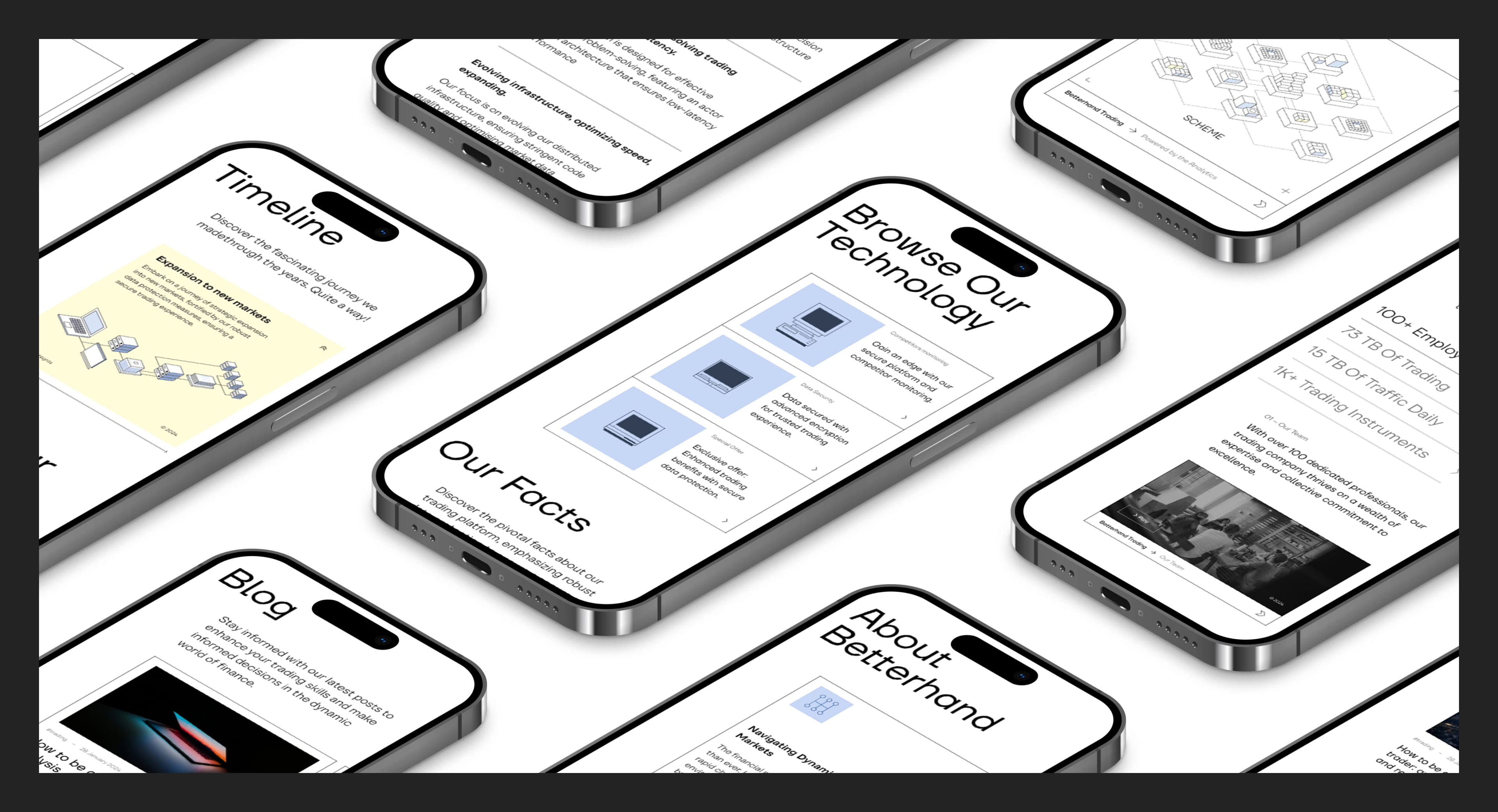
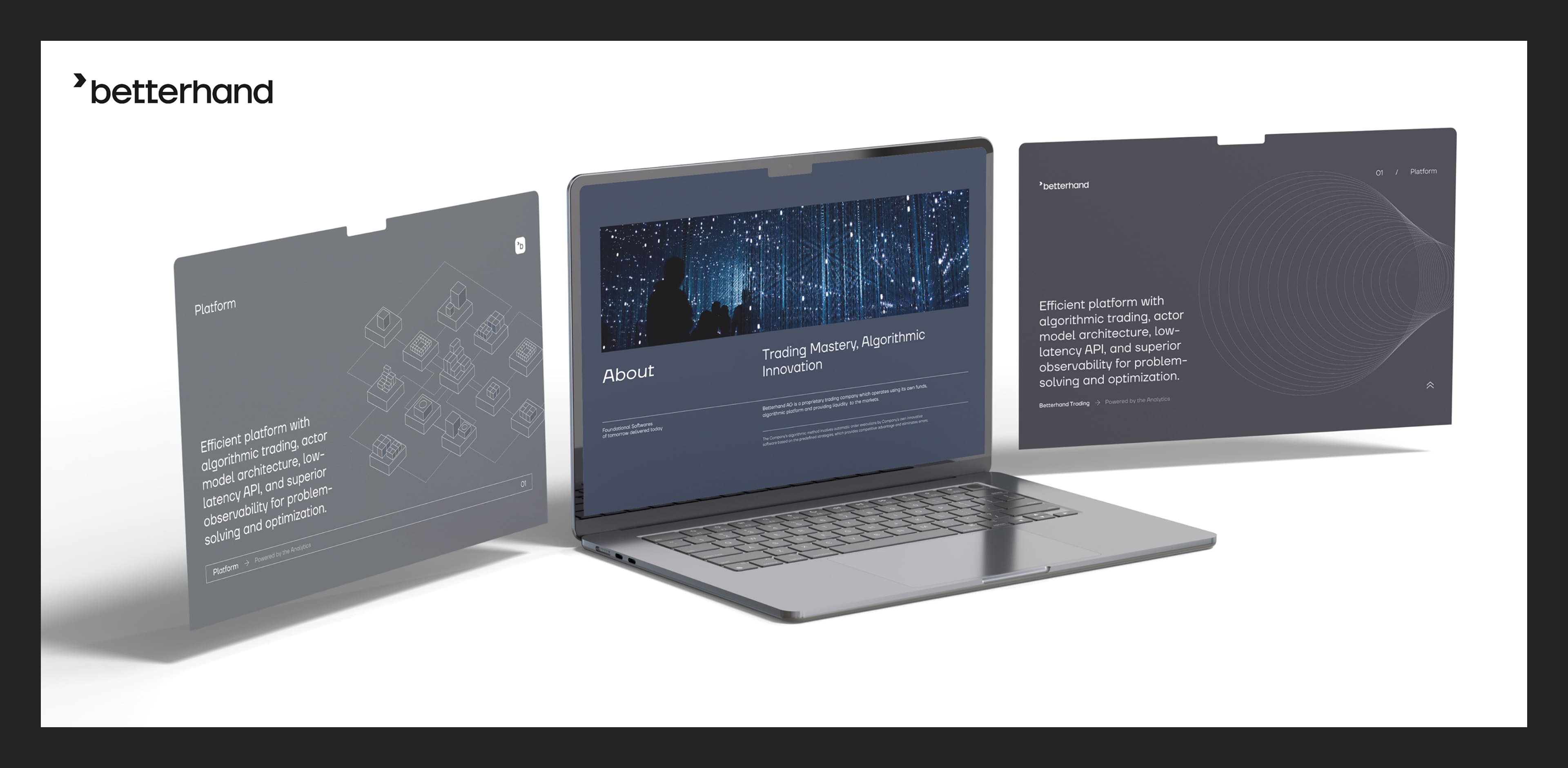
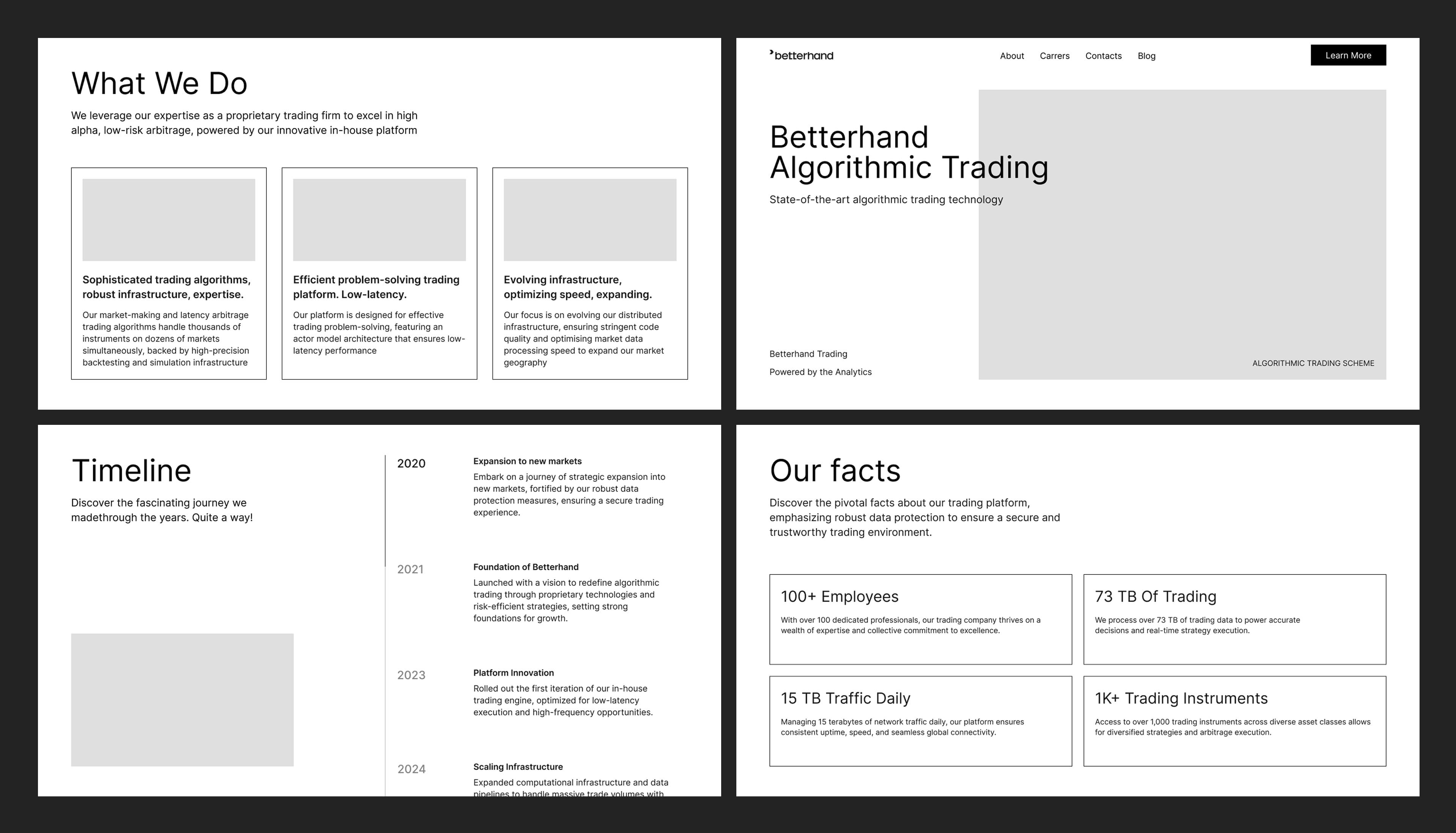
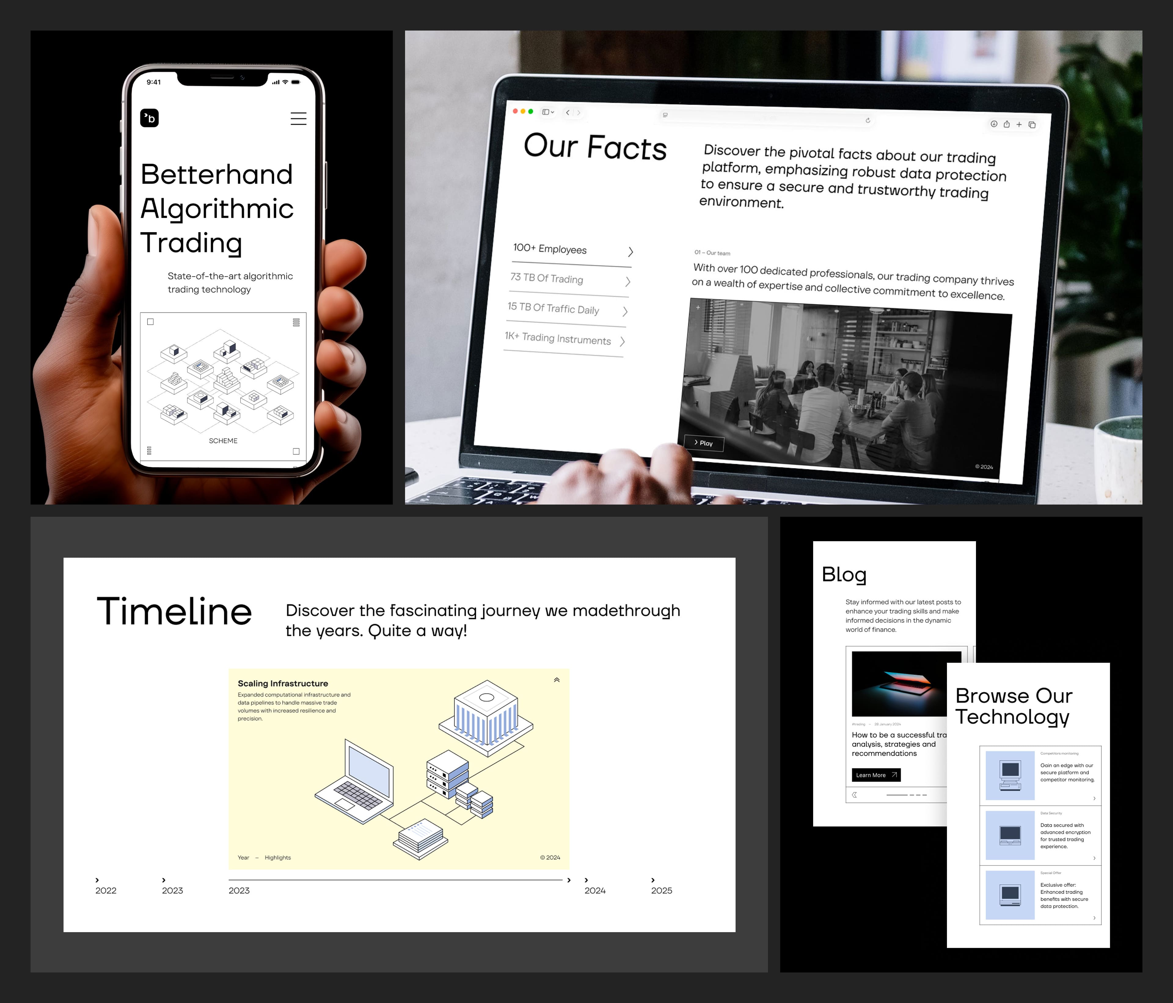
Contact us

Events
IT
No items found.

Website Design for the Fintech Company Betterhand

We created a modern, clean website design for a financial technology company.

Betterhand, a fintech company providing automated trading services, received a new brand identity from our team. Based on this updated visual system, we designed a completely new corporate website.
What we did
We developed a new website design that reflects the brand’s updated visual identity. The website positions the company in the market and clearly communicates Betterhand’s values, services, and capabilities.
Project Highlights
  • A modular design system at the core of the website. The modules can be easily combined and rearranged, allowing for fast creation of new pages and solutions.
  • Visual lightness as an essential part of the brand’s tone of voice.
  • Geometric visual language applied across all elements, from illustrations to icons.
  • A bold and distinctive typographic approach.
Project Overview
Betterhand specializes in algorithmic trading. The company has developed its own proprietary automated trading platform. The team consists of financial experts with many years of experience in global trading. The company is based in Switzerland.
Objectives
  • Develop a new website design that conveys a technological and restrained visual identity
  • Create a website structure aligned with user journeys
  • Prepare full-page mockups for all sections
Research & Analytics
Betterhand operates at the intersection of two domains and philosophies: technology and finance, innovation and conservatism. We analyzed references and benchmarks across both directions to find the right visual and strategic balance.

We also mapped user journeys and conducted an SEO audit. These insights formed the foundation for identifying optimal usability solutions and improving the site’s performance and structure.
Structure
Based on user analytics, we developed a prototype incorporating UX/UI best practices. Our team focused on addressing the needs of a highly specialized professional audience.
Design
The core idea of Betterhand’s brand platform is result orientation — sharp focus, nothing excessive. For the website, we created a restrained design with a strong emphasis on content clarity.
We applied principles of Swiss design:
  • Modular structure
  • Strict grid system
  • Geometric line-based illustrations
Typography became a key element of the visual style. We used a combination of TT Firs Neue — with its precise geometric forms for bold headlines — and TT Firs for clean, highly legible body text.
Result
We delivered a new corporate website design that:
  • Introduced a refined visual language aligned with the brand’s values
  • Improved overall user experience
  • Developed an SEO-optimized site and page structure to attract new users through search engines

Next case