Contact us

Events
IT
No items found.

Branding for the Fintech Company Betterhand

We refreshed Betterhand’s visual identity: created a new logo and applied the updated brand design across the website, presentation materials, and digital media.

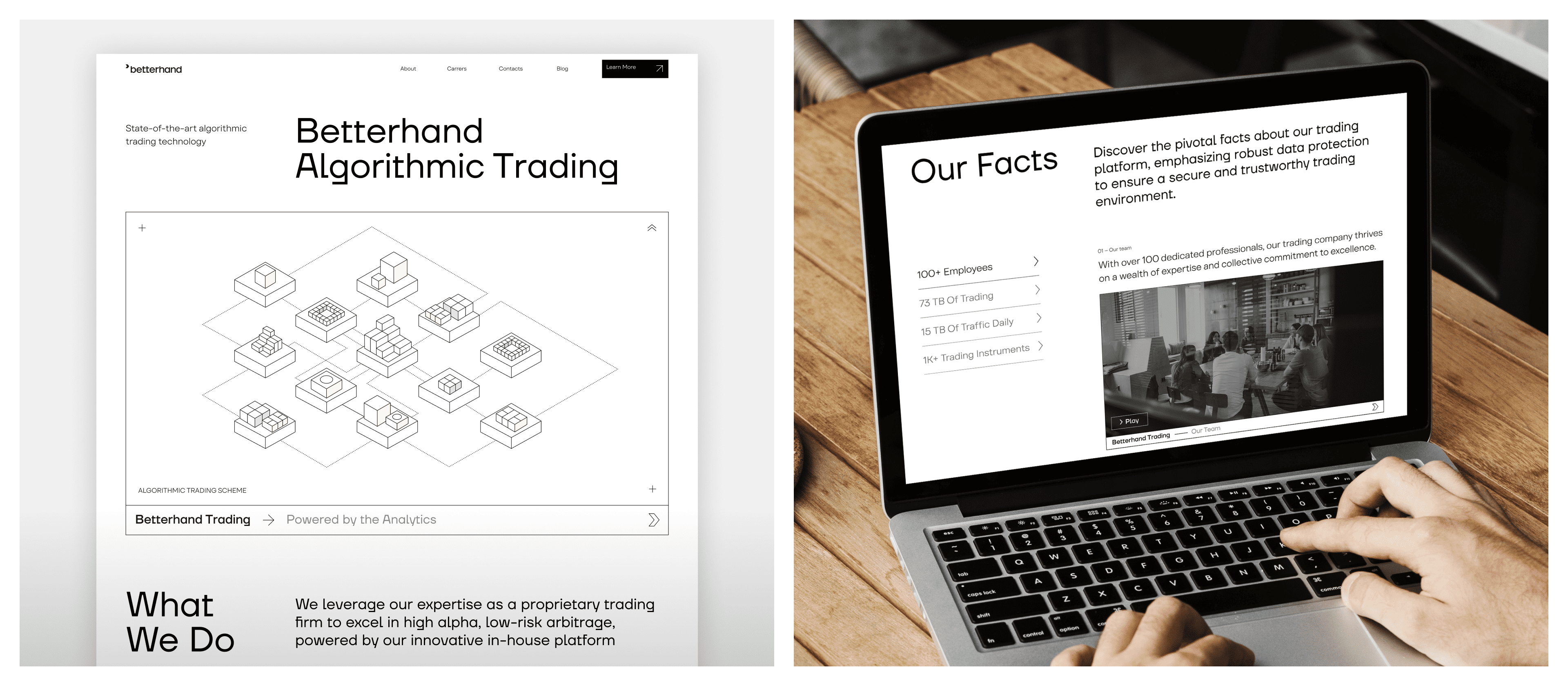
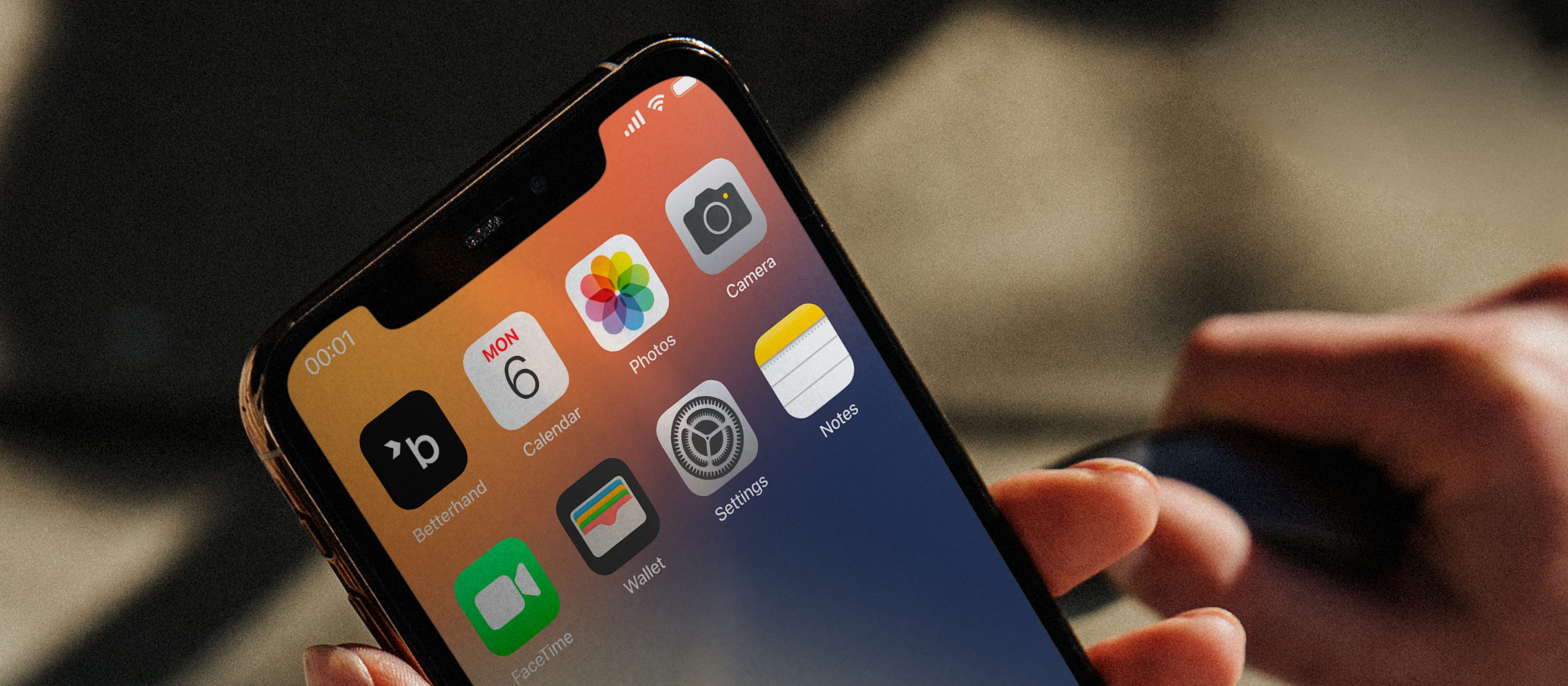
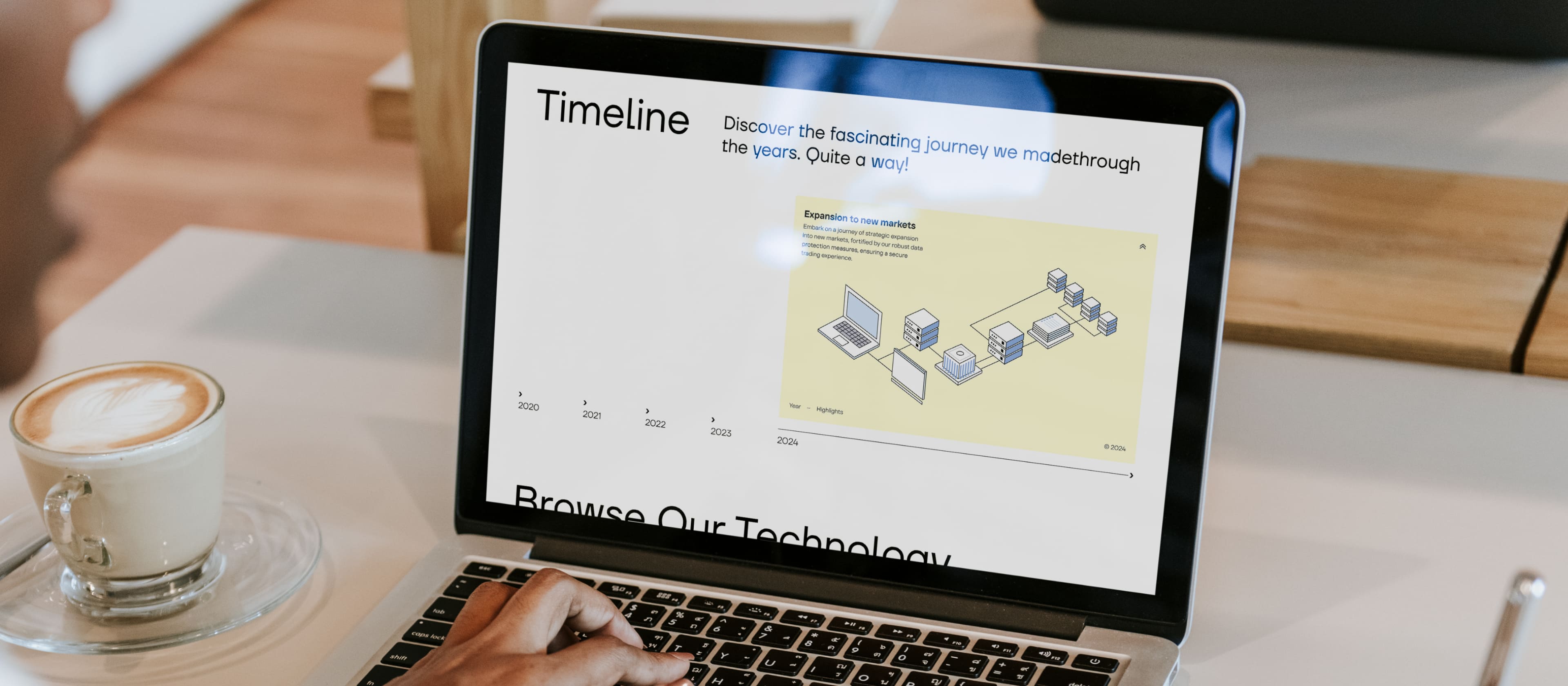
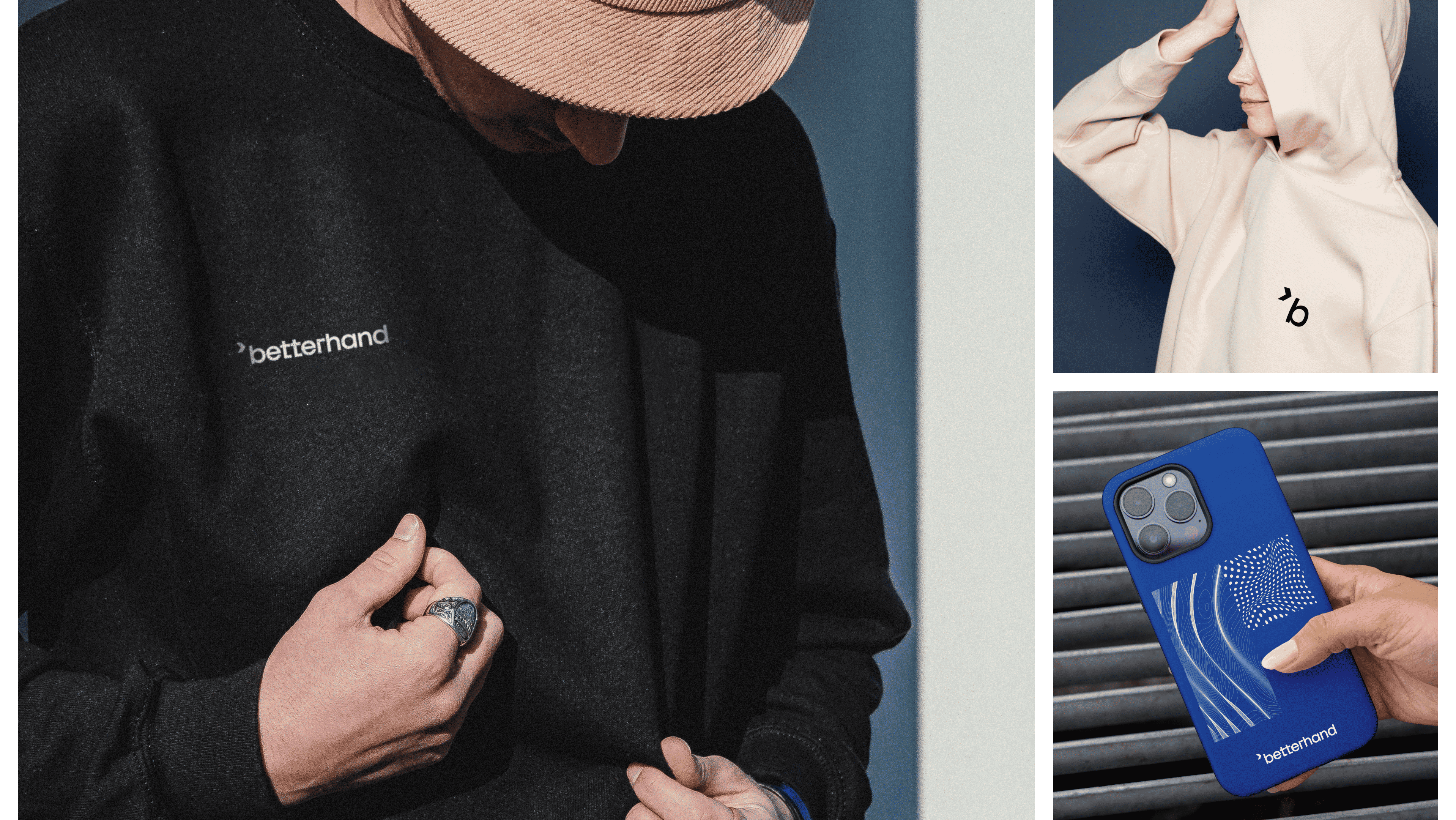
Betterhand — a fintech company specializing in automated trading — developed its original style 15 years ago. Today, the company has reached a new level and is expanding into new markets. We created a new visual identity for Betterhand to reflect this growth.
What We Did
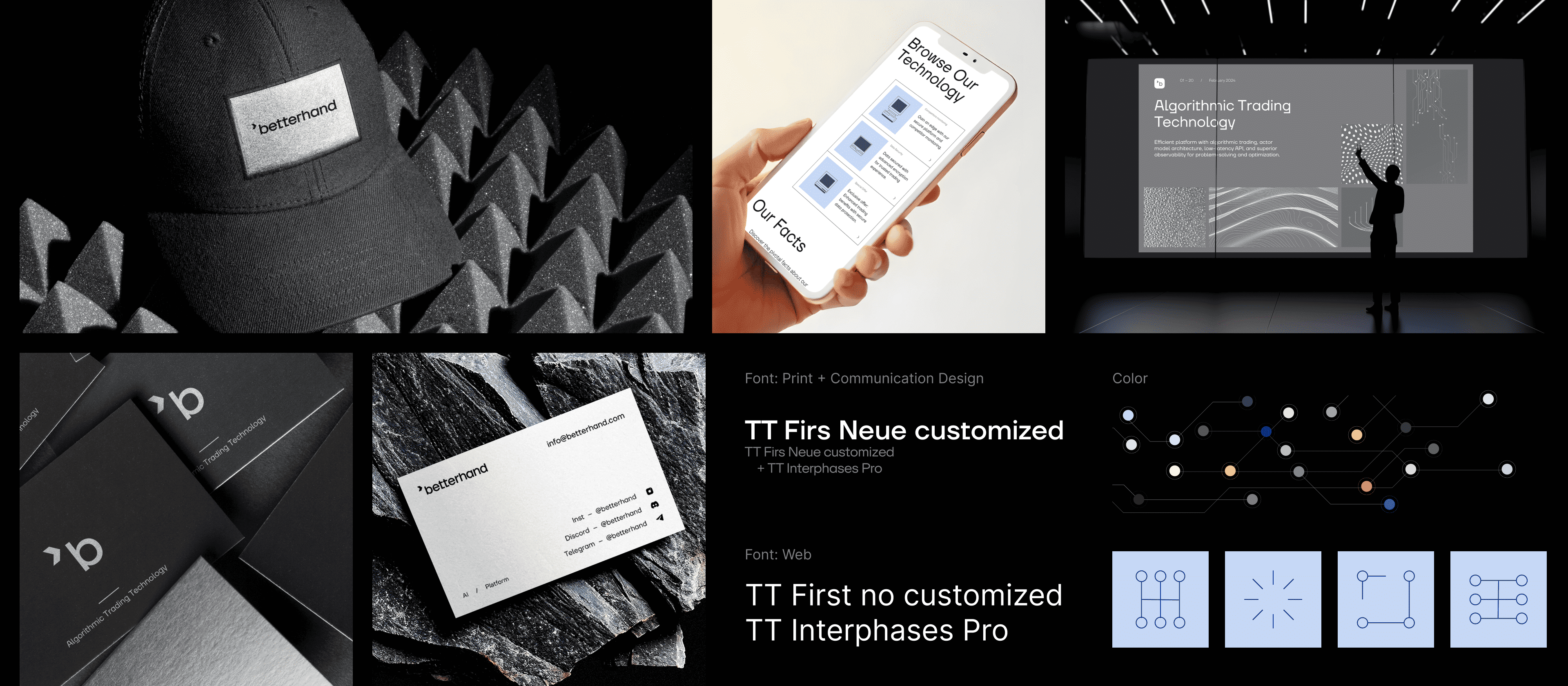
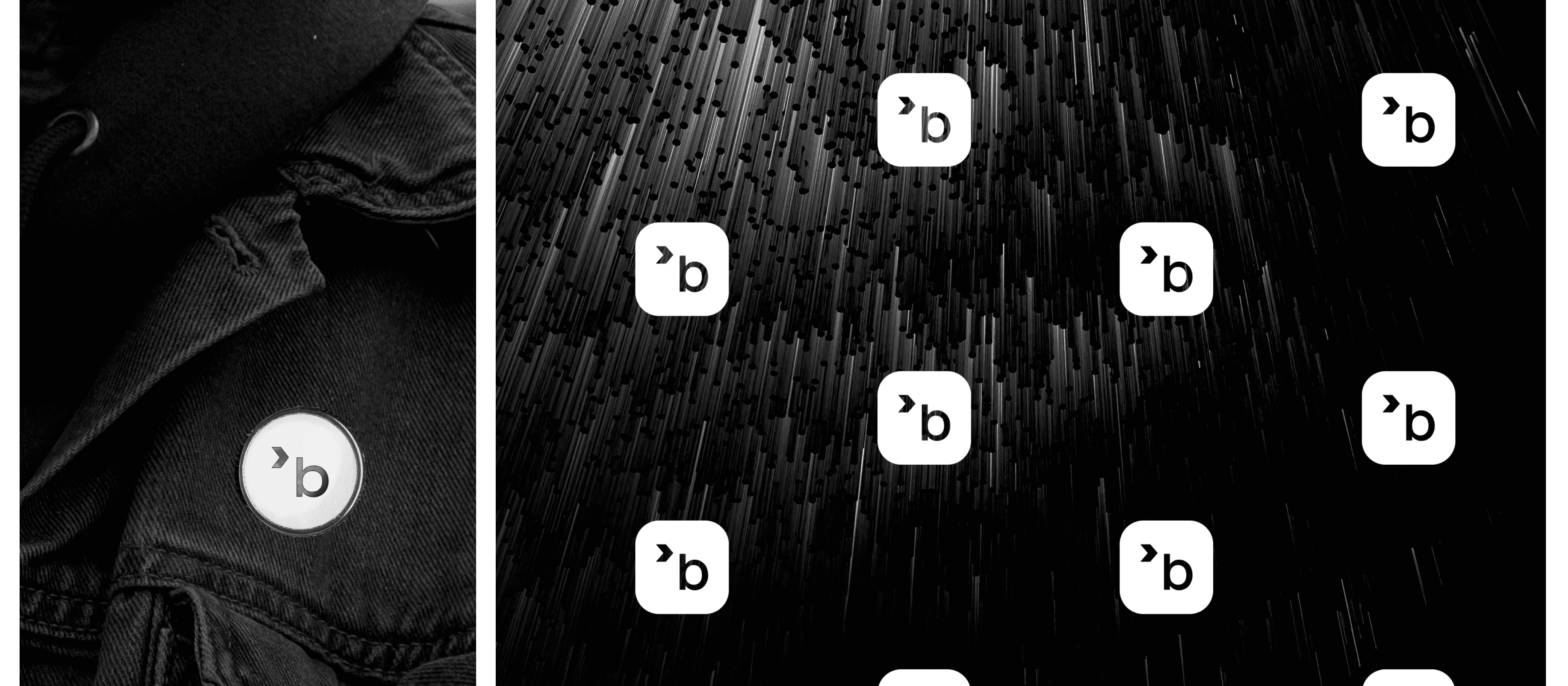
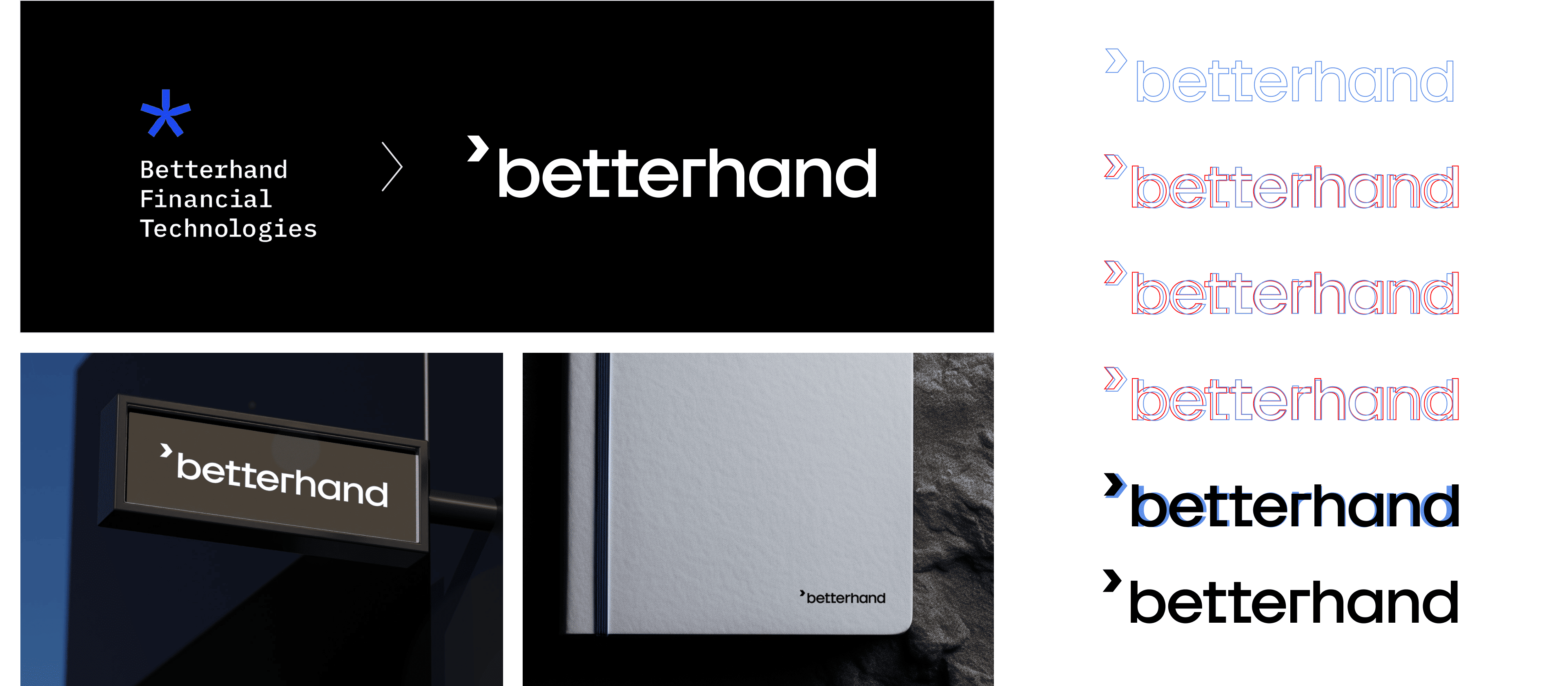
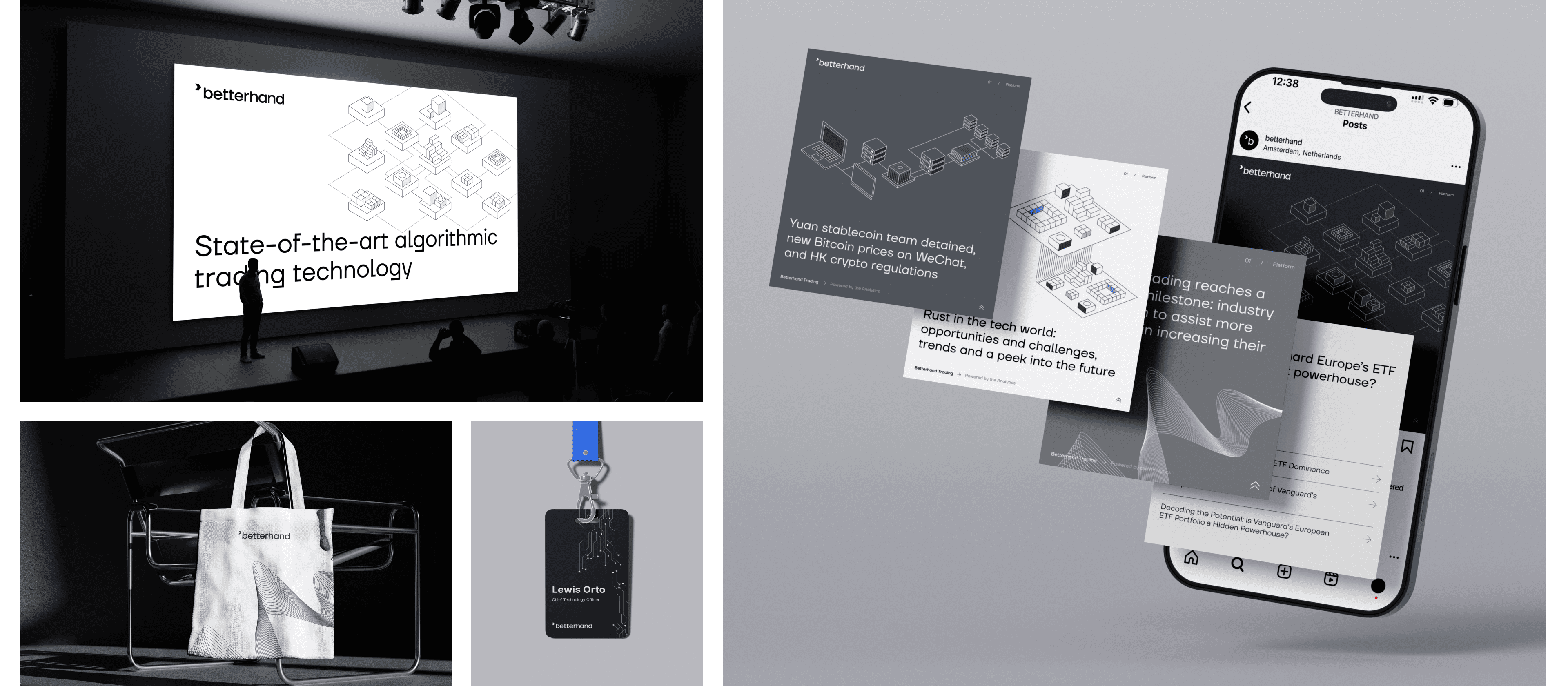
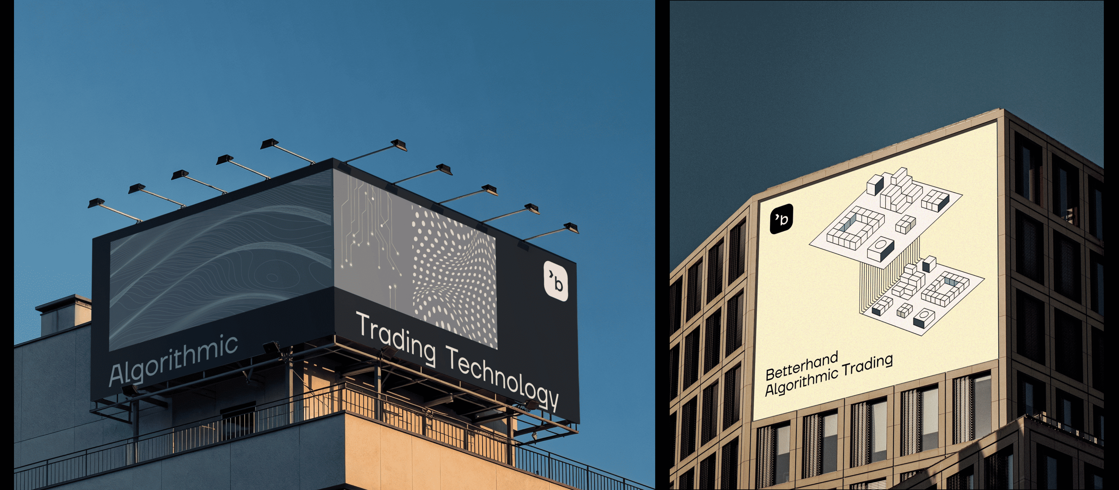
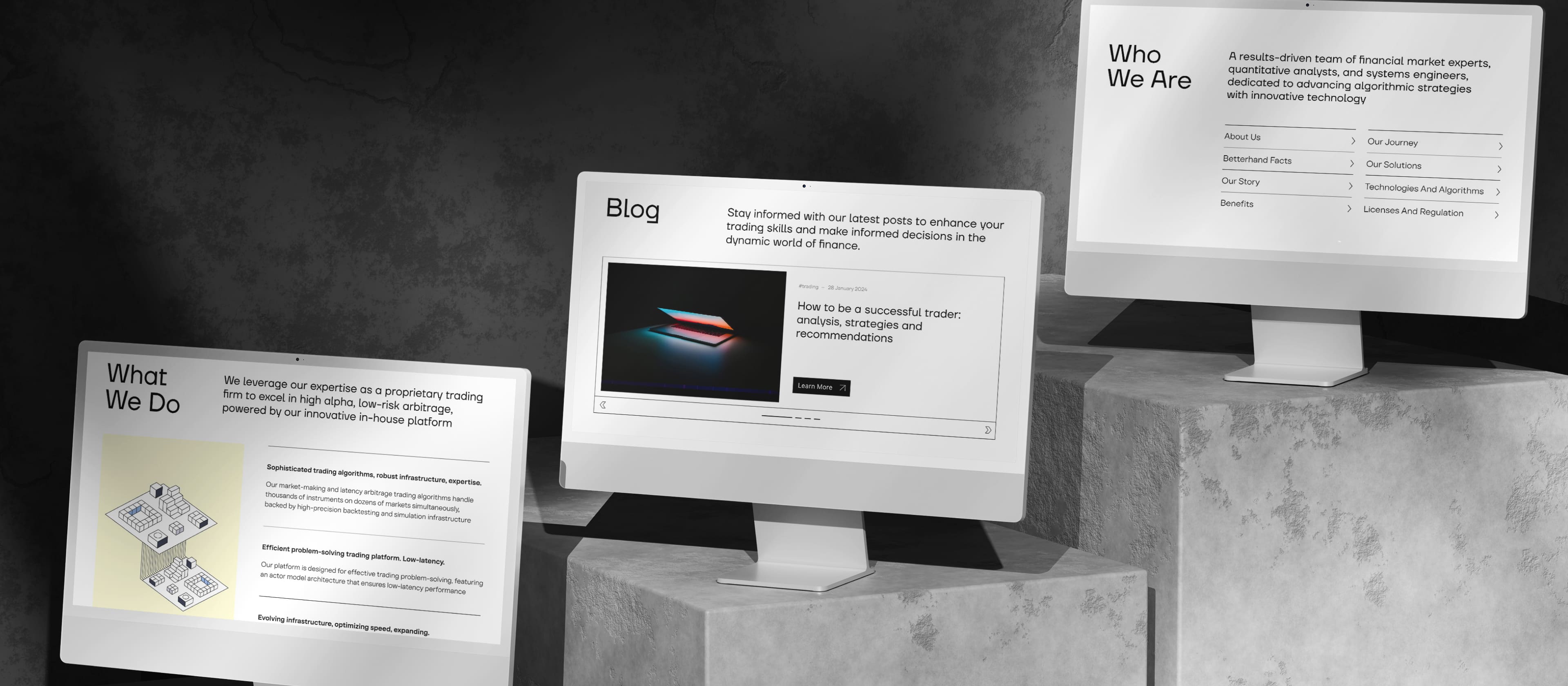
We updated the corporate identity: designed a new logo and applied the new brand visuals across the website. We also created presentation materials, social media assets, and branded merchandise.
About the Project
Objectives
  • Develop a new visual identity that reflects the company’s evolved values
  • Redesign the logo
  • Create designs for communication and presentation materials
  • Compile a brand book outlining all components of the new identity
Process
Research
We created a tone-of-voice matrix that included competitors and market benchmarks to define Betterhand’s positioning within the fintech landscape.

The client team prepared a brand platform to support the rollout of the updated brand.
Logo
We decided to create a custom typographic logo. Our type designer refined the letterforms to align with the new positioning — adding distinctive shapes and a more balanced overall structure.

The mathematical “greater than” symbol (>) became part of the logo. Betterhand is more than just a trading company or platform — and this symbol became a key element of the brand’s visual language.
Typography
The new Betterhand identity needed to embody the brand’s values: directness, focus, and performance. We chose simplicity and geometric clarity as our main visual principles.

For headlines, we used TT Firs Neue with its strict geometric forms. For body text, TT Firs was selected — a clean, readable typeface that works well across both large and small formats.
Color Palette
We developed three palettes:
  • Primary (Dark) — built around a sophisticated gray and a rich, technological blue.
    This combination helps highlight key content while maintaining the brand’s restrained tone — suitable for presentations, infographics, and photography.
  • Light Palette — based on soft pastel tones, designed for web interfaces.
  • Accent Palette — complements both the dark and light themes.
Design Applications
We demonstrated how the identity system works across multiple formats and communication channels — including complex financial data visualization.

The use of linear geometry and clean, balanced shapes proved to be highly versatile. This approach ensures consistency and scalability across all touchpoints: presentations, social media, and merchandise.
Results
We built a cohesive new visual identity system.
Betterhand now has a complete set of brand tools for communication:
  • Logo
  • Color palette
  • Core graphic elements and usage guidelines
  • Typeface system
  • Social media visuals and merchandise examples
  • Presentation design
  • Brand guide

Next case