


We Interact with the Brand, Not the Interface: Why Emotions Matter More Than Conversion in Fintech
Alexander Ustinov, founder of Beavers Brothers and an expert in branding and communication design with 20+ years of experience, 500+ clients worldwide, and 50+ international awards, explains how the color of a bank card can defeat bureaucracy — and why “boring” design is sometimes better than innovation.
Today, we’ll talk about brand voice and emotional design. This is a separate but extremely important topic. I work in branding, communication design, and interfaces, so I look at user experience holistically, without separating these concepts.
Founders and designers always want to make things “cool.” Nobody wants to make something bad. But then why does the result not always meet expectations?
Often, “customer experience” (CX) is understood as only the interaction with the interface. Product teams are usually guilty of this. However, the user interacts with the brand as a whole. The experience within an app is just one piece for them. That’s why people recommend one brand but not another, feel warmly toward one, and are indifferent toward another.
Designers in product teams often complain: “I’m forced to think only about conversion and financial metrics.” But for the client, everything matters collectively: recognition, loyalty, UX, and emotional connection. People perceive the brand as a whole.
Brand as a System of Factors
The gap between a specific scenario (experience of using functionality) and the actual perception of the brand must disappear. Why does this gap arise? Because different departments forget that the brand itself has value:
- Business focuses on financial results
- Product focuses on convenience (usability)
- Marketing focuses on awareness
But the client sees all of this simultaneously.
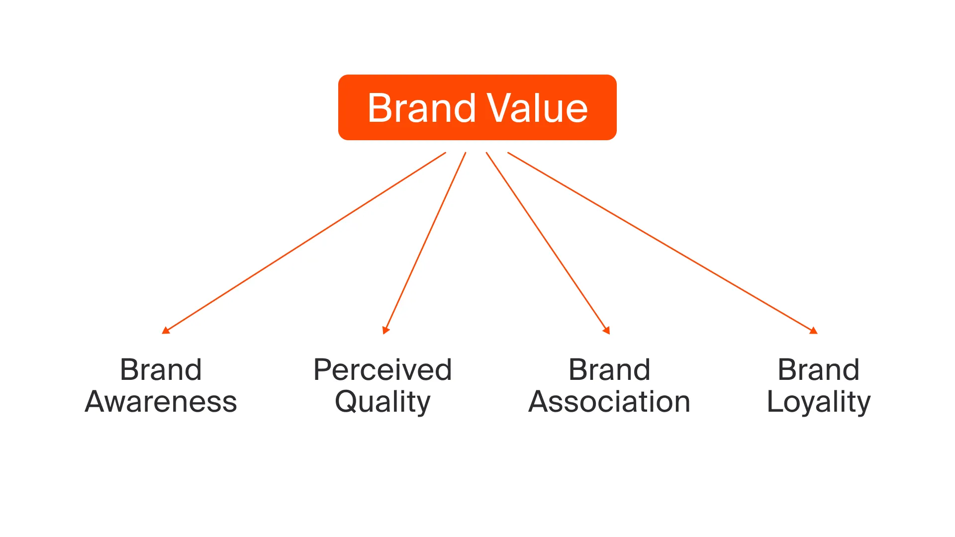
From a business perspective, all metrics matter. The brand should be recognized, perceived positively, and distinguished from competitors. In fintech, competition is fierce, and focusing only on a convenient UI can make you lose the race.
At the highest level, a brand should meet four key indicators:
- Authenticity — the user understands that the brand shares their goals and values
- Reflectiveness — the user sees that the brand operates in their segment or context
- Differentiation — the brand stands out from competitors
- Clarity — the brand perception matches the problem the product solves
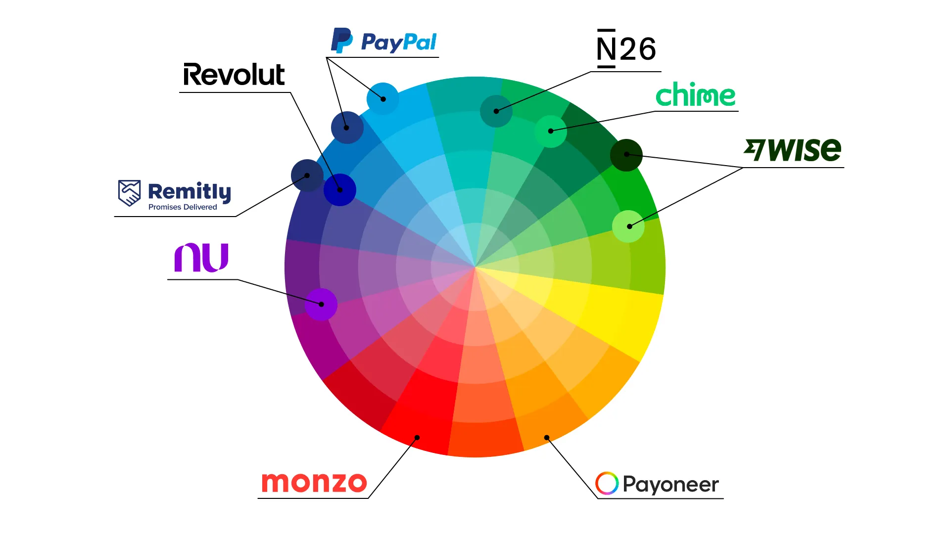
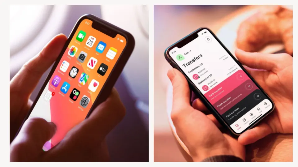
Case: Revolut Evolution

Let’s look at the brand Revolut. Their visual transformation is interesting. A logo is not just an image; it reflects the evolution of the entire business.
At the start in 2015, Revolut positioned itself as an innovative service, which was reflected in its name and visual style. Today, their style is more restrained and may seem “boring.” But this is a logical step: the company has grown and now operates across many categories (banking, transfers, investments). In each niche, Revolut competes with different players, and the new style allows it to look organic and recognizable everywhere, without creating conflicting experiences.
Case: Nubank (Brazil)
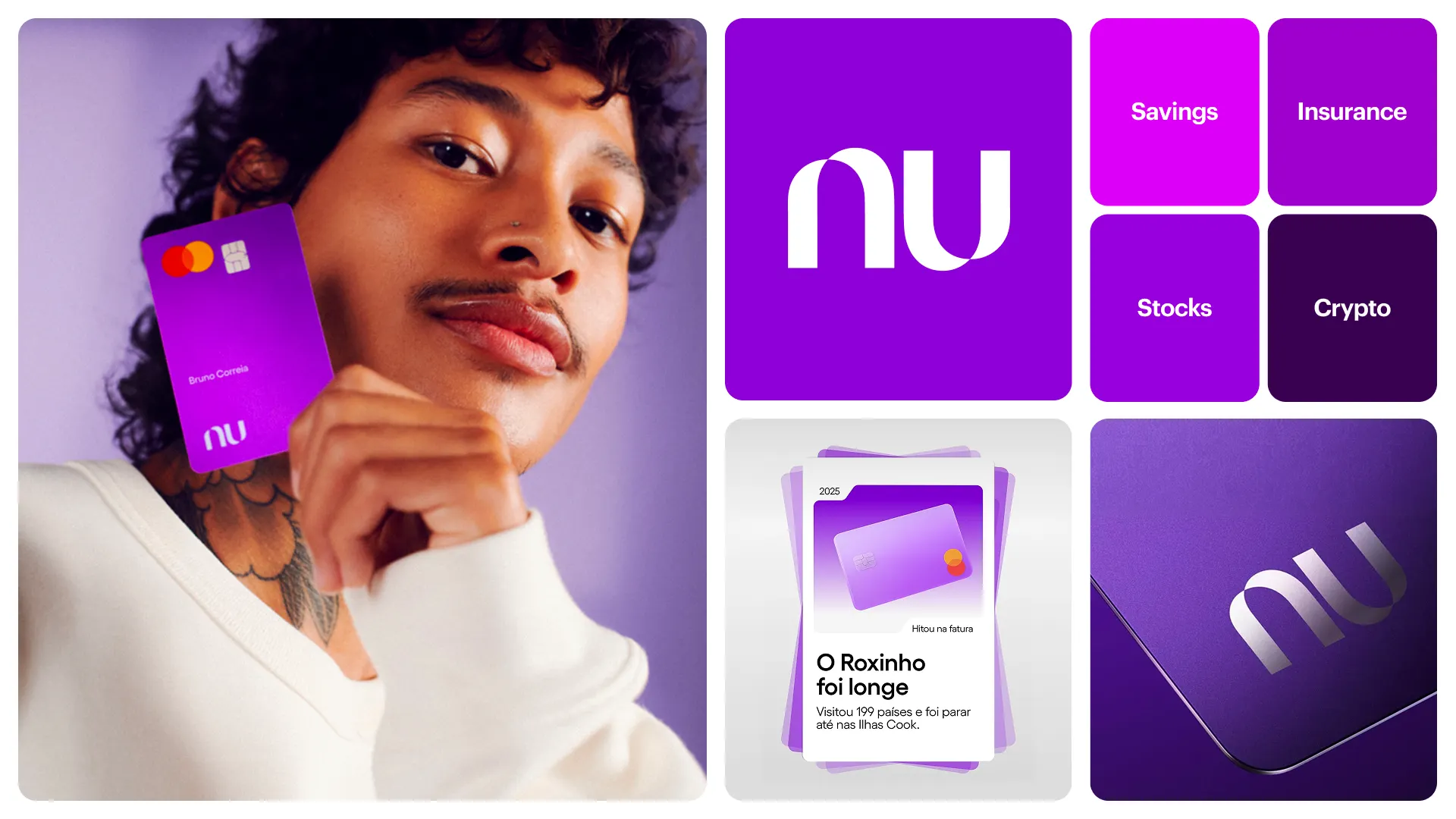
An example of authenticity — Brazilian Nubank. This is not just modern design; they approached brand building holistically.
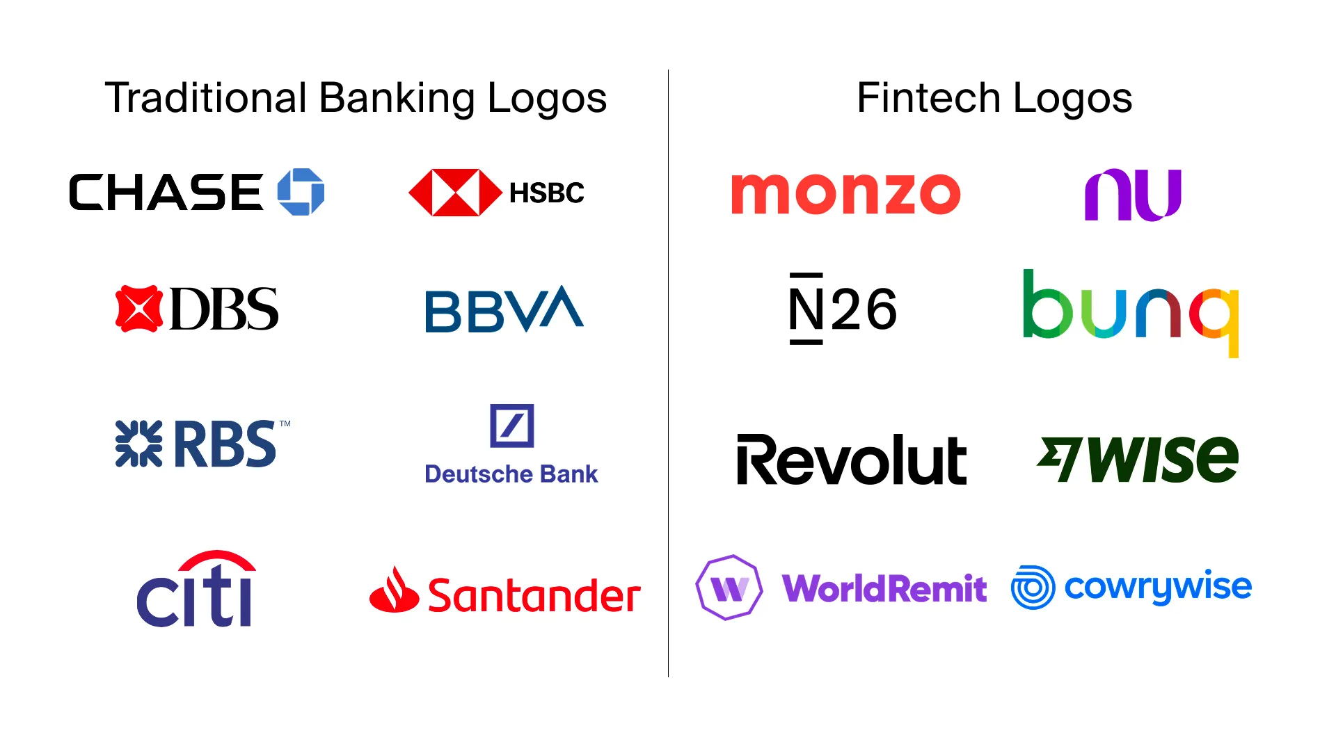
The name “Nu” (Portuguese for “naked”) symbolizes transparency and lack of bureaucracy — a “bank without a suit.” At the same time, it sounds like “New.” Their purple color strongly differentiates them from competitors. The largest Brazilian banks use orange, yellow, and blue. In Brazilian culture, purple is perceived as fresh.
Nubank embedded these values (lack of bureaucracy, newness) into the brand’s foundation and conveys them through everything: name, color, logo shape (intertwined ribbons), and communication. This created a strong emotional connection that cannot be achieved through the interface alone.
Geography and Context: N26 vs Monzo vs Bunq
In positioning, name, color, and font are critical.
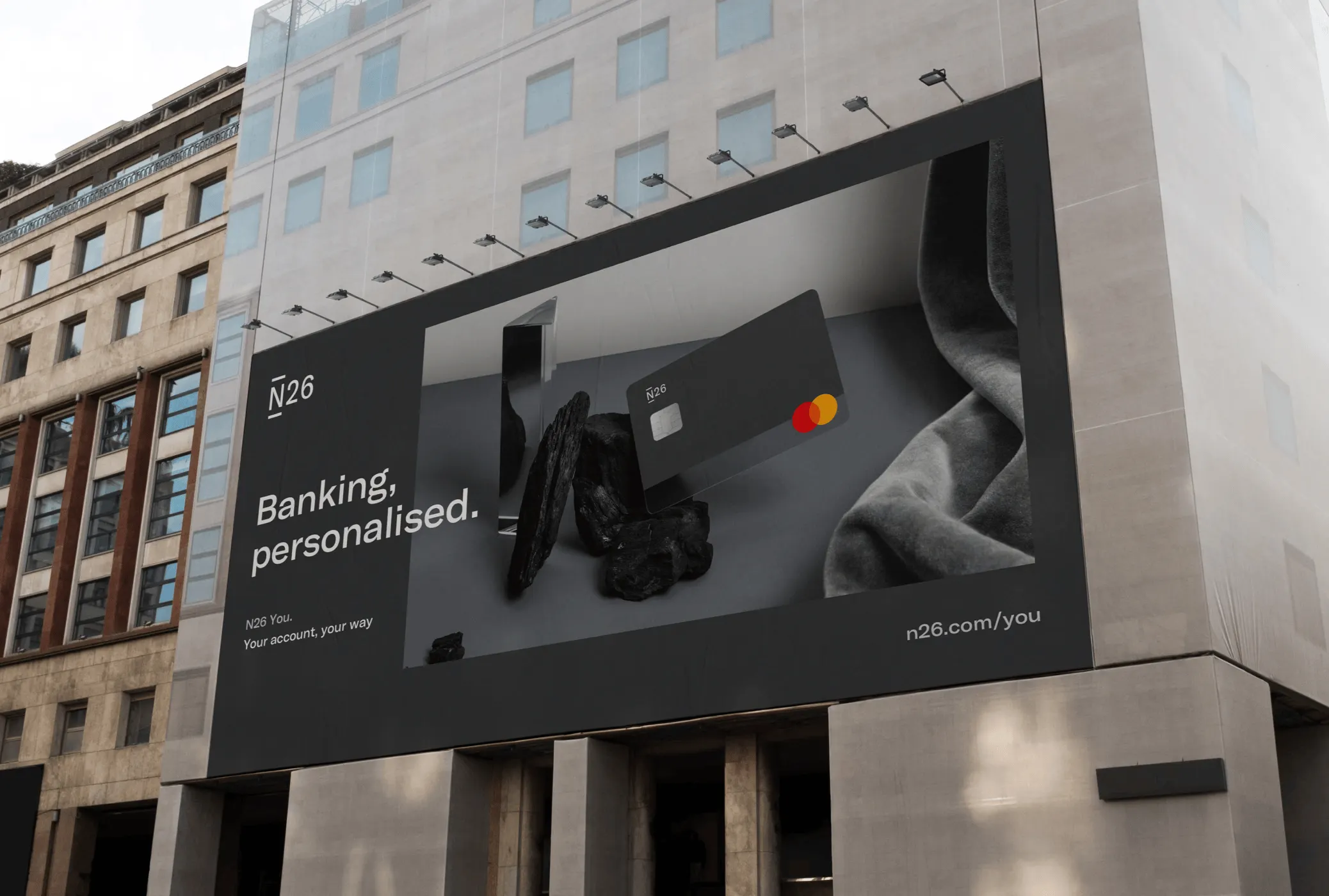
N26 (Germany) — The German market is conservative. N26 chose a very clean, digital, slightly dry style. For Germany, this is bold and daring. The name is technological (N = new/number). They communicate: “We have no bureaucracy,” knowing Germans are frustrated by it. Their cards, however, are bright.
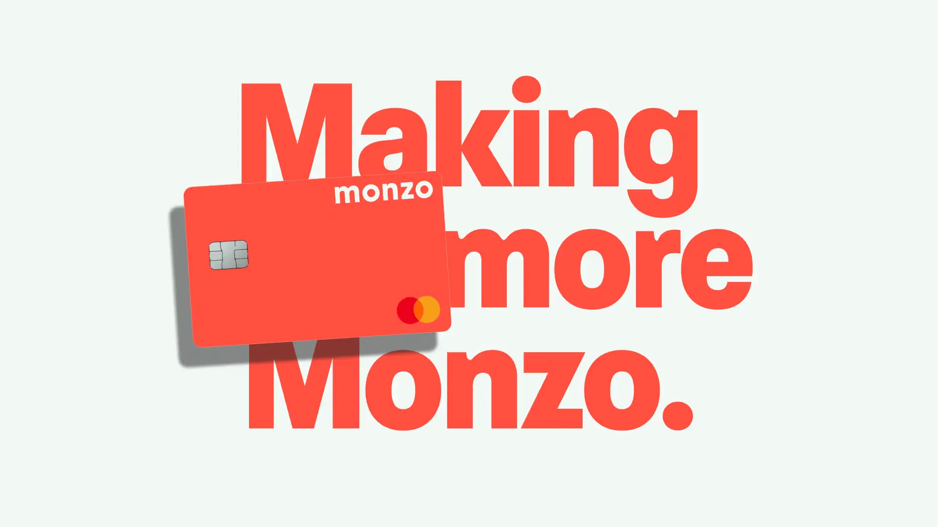
Monzo (UK) — British fintech Monzo took a different approach. They chose coral and positioning far from “cold tech” (unlike Revolut or Wise). Their name is invented, without roots like “bank” or “pay.” They occupy the “friendly” bank niche, creating a strong emotional connection.
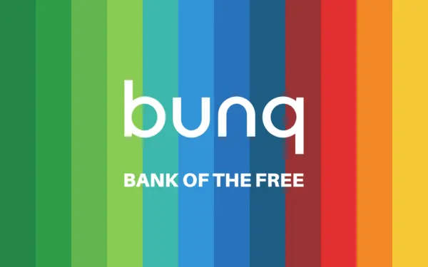
Bunq (Netherlands) — “Bank of the Free.” They understood all colors were taken, so they chose a rainbow spectrum. Their audience is expats, freelancers, and liberal-minded people. This is reinforced by the exclamatory name and very free visual style.
Tone of Voice and Copy
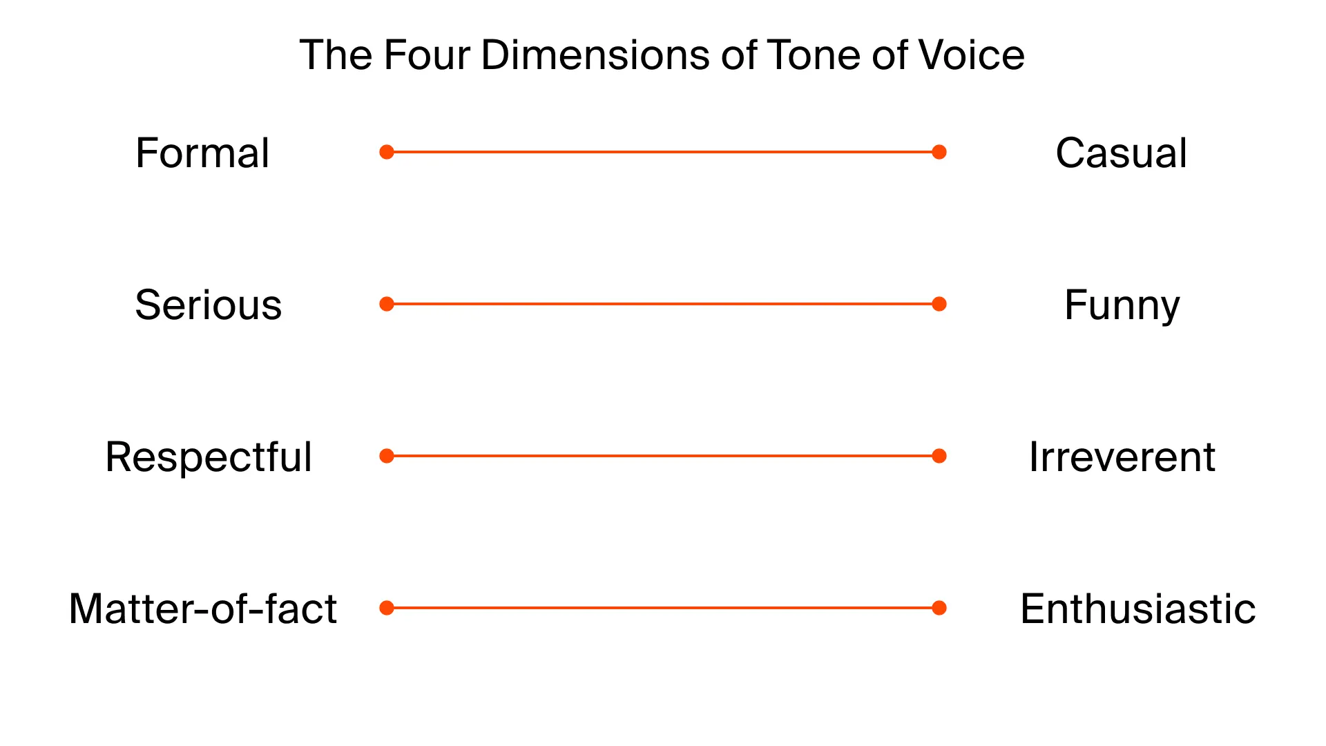
Even in the AI era, which analyzes text more than visuals, brand voice (Tone of Voice) is primary. Before designing visuals, we need to understand how we talk to the user: formal or informal, serious or humorous. This defines website copy, app content, and support communication.
Remember the success of Tinkoff or Rocketbank support — they spoke humanely, not by scripts. Their support created brand value in the consumer’s eyes and spread by word of mouth, attracting users.
Example from our practice: Appear
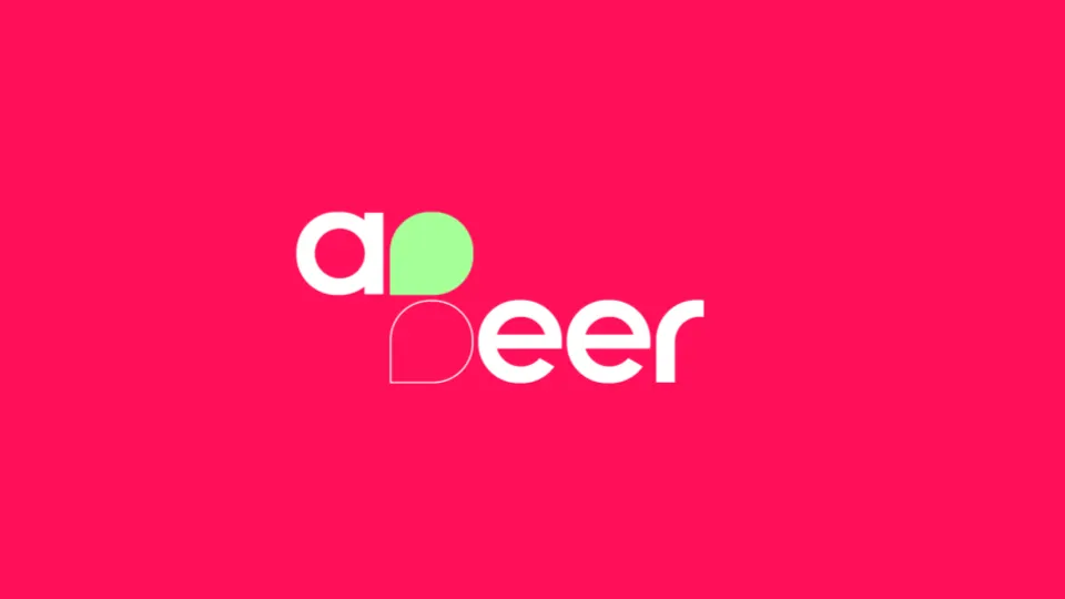
At Beavers, we developed the money transfer product Appeer. The audience was expats. The market was dominated by old players like Western Union with an outdated Tone of Voice. We found a niche through the name (“App” — the application is the leading platform for interacting with the service, “Peer” — both “equal” and “P2P”) and color palette, differentiating from competitors. The app icon and interface support this idea, creating an emotional connection. Emotional design is not just emojis; it’s about choosing a niche and understanding what will evoke a positive response from your audience.
Psychology of Color and Shape
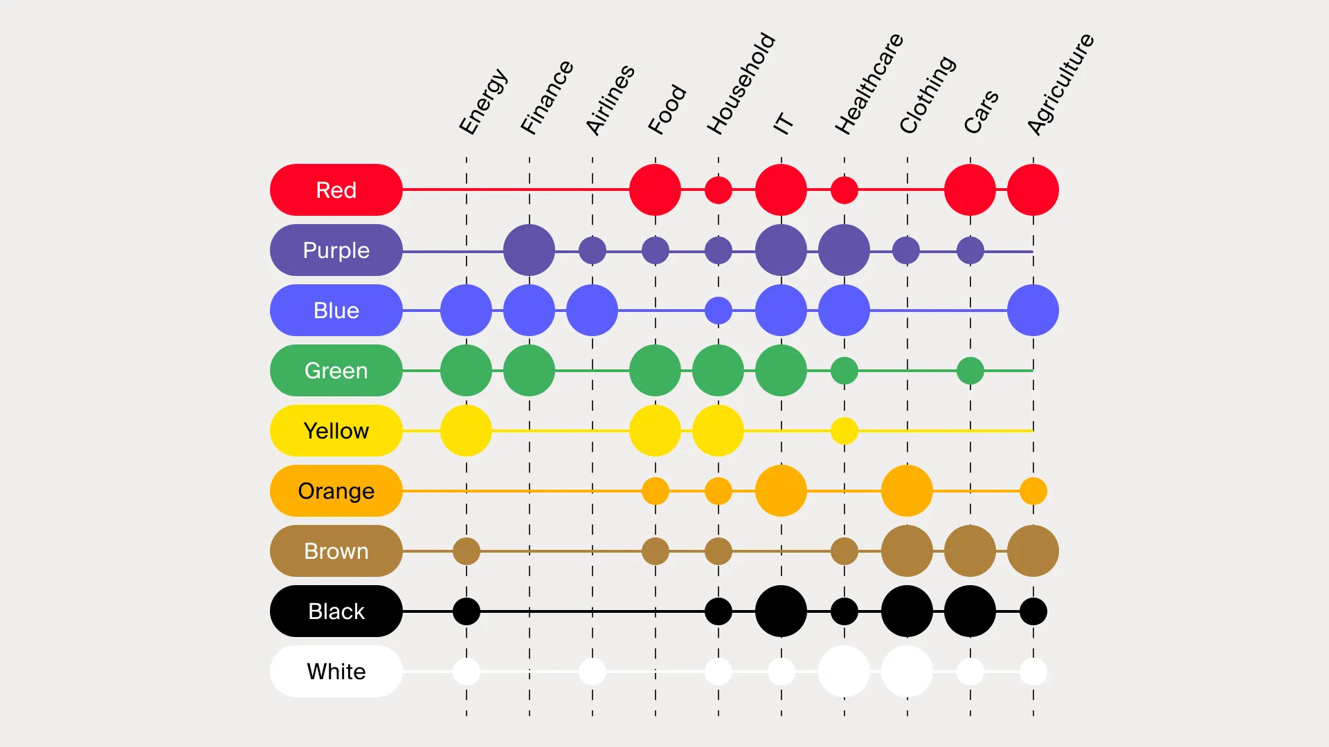
Colors matter. Finance uses a lot of blue and purple (trust, tech), but little brown. If you choose blue, you cannot expect to be seen as a rebellious brand — it will create dissonance. Classic banks are conservative for a reason.
If support for a “fun” bank speaks formally and dryly, users will have a negative experience due to expectation mismatch.
Examples:
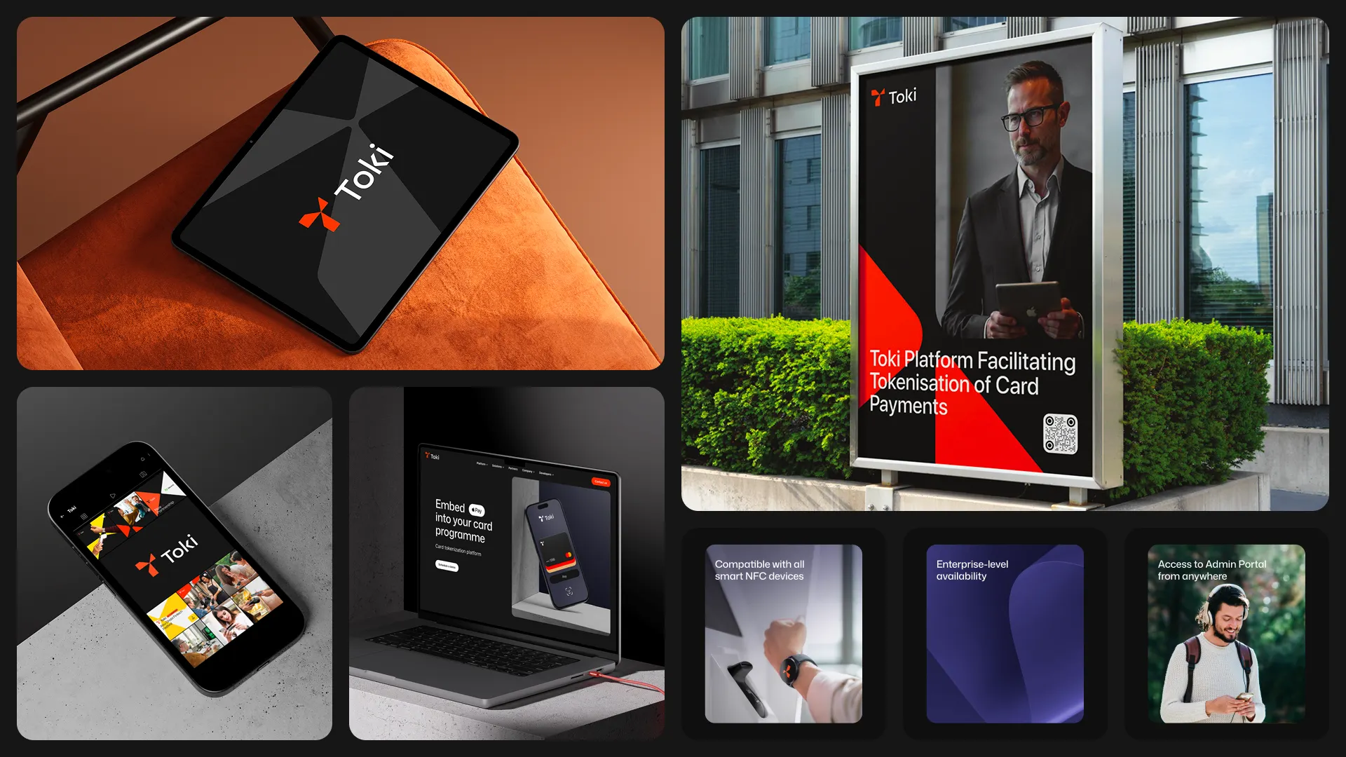
- Toki (London) — B2B banking product. Used orange (innovation) and black (reliability). Balance is important to avoid looking too playful for serious clients.
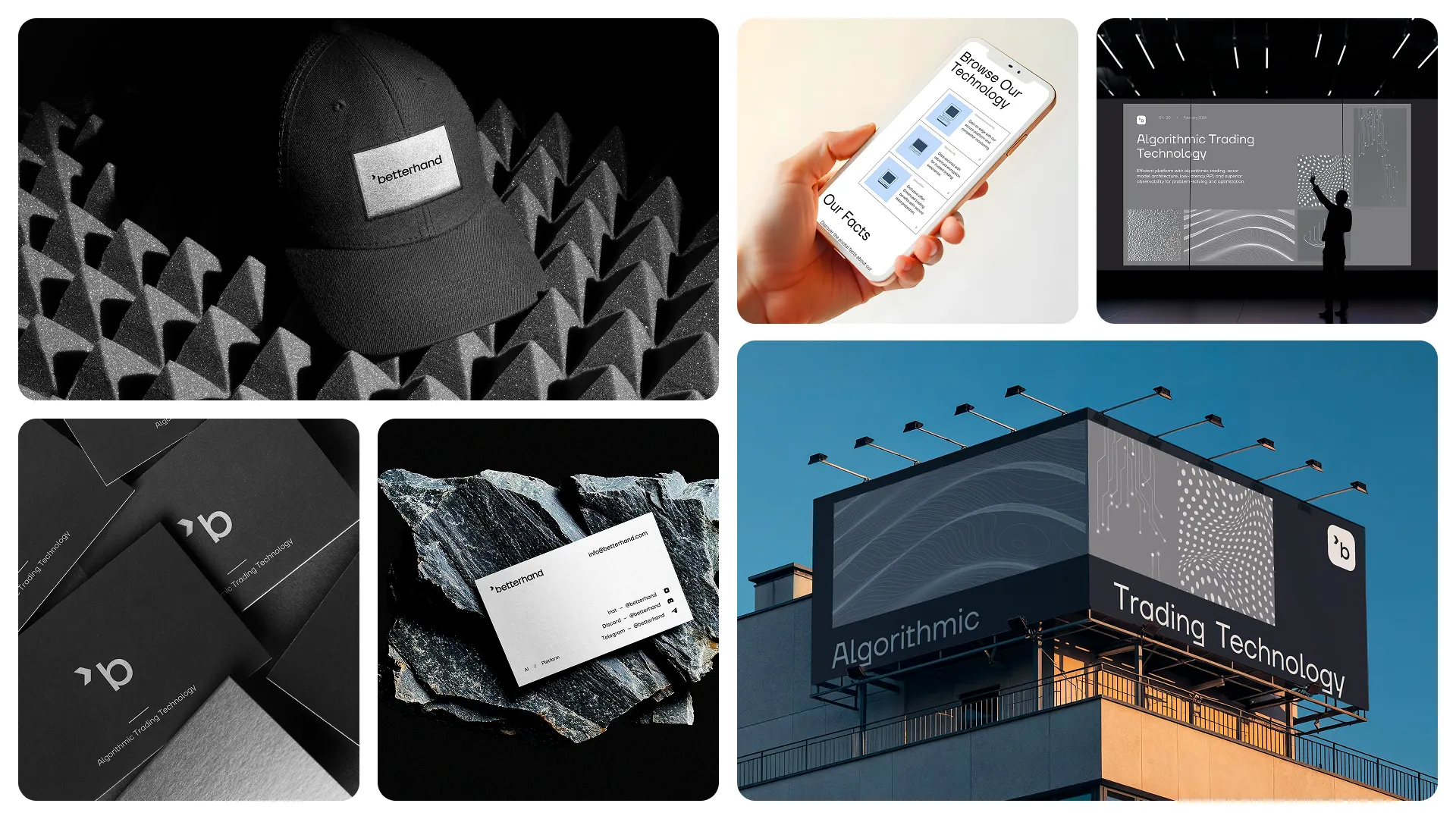
- Algorithmic trading (Switzerland) — Swiss fintech looks very scientific and dry. We highlighted it only through typography (cut fonts), adding a bit of character while keeping a scientific feel.
Conclusion
In fintech, competition is fierce. Even with perfect interfaces, you need a strong brand.
An authentic, clear, and differentiated brand:
- Saves marketing costs
- Speeds up market entry
- Increases customer loyalty (studies show 20% growth where emotional design exists)
- Increases brand value and provides leverage

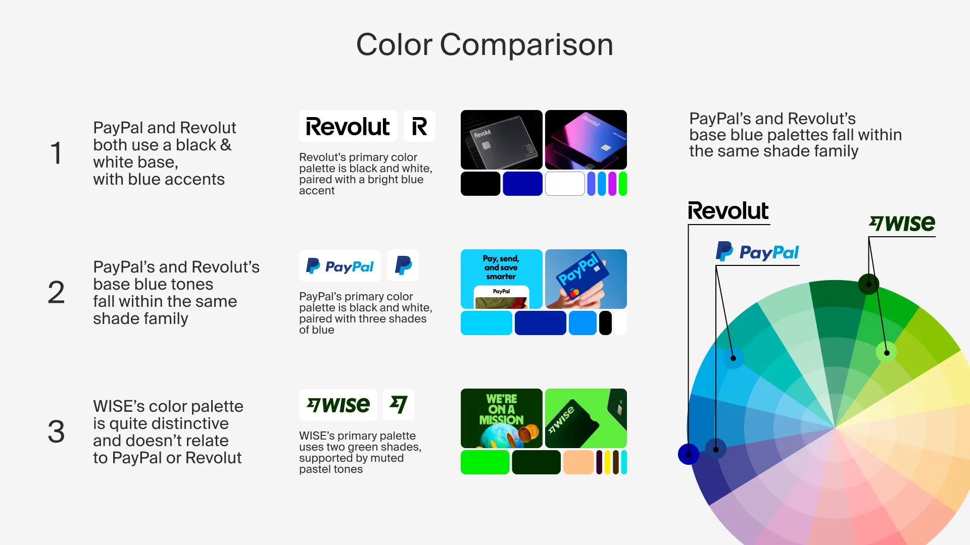
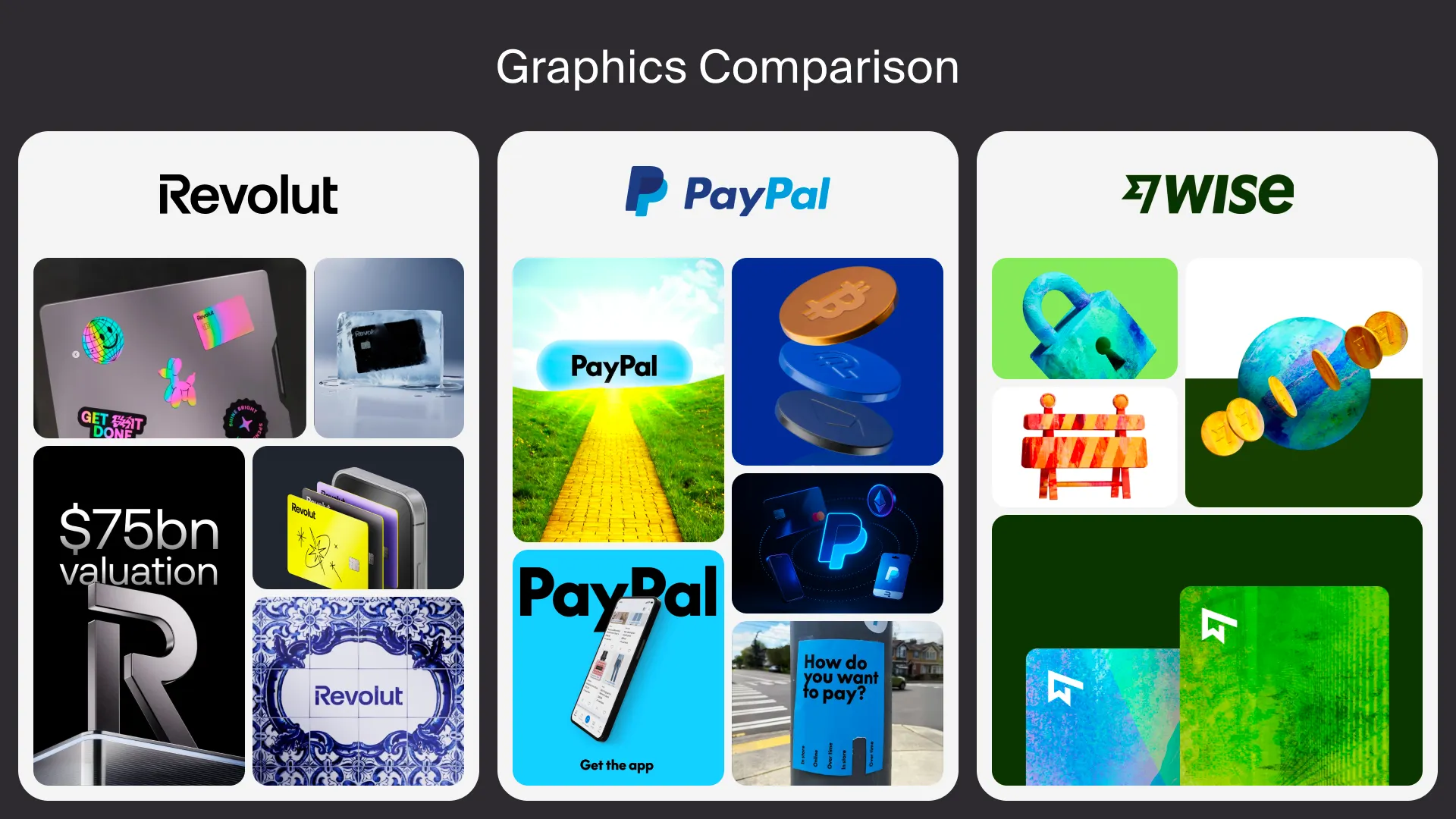
Look at Revolut, PayPal, and Wise — they do the same thing but look different. Different fonts (Revolut has bold caps, Wise has its own unique font), colors, and visual languages. This allows users to instantly grasp the essence of the brand.
A brand is a complex system. It is not just interface, marketing, or conversion. It is managing user emotions through name, colors, fonts, and visual culture. Let’s remember this and manage it consciously.
I talked about this topic at one of the design meetups organised by our company. You can watch the full presentation on YouTube to dive deeper into the nuances of emotional design.
Subscribe to our Telegram channel to find more information about our upcoming meetups and design events.